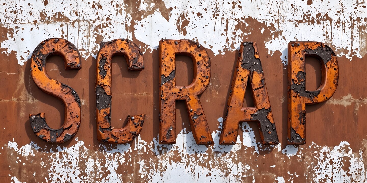
Wasteland Rust Metal Text Effect
In this tutorial, you will learn how to create a wasteland-style rusted metal text effect using Artificial Intelligence in Art Text. We’ll start with plain 3D text, add textures and shadows, and then make it apocalyptically realistic with the AI Wizard.
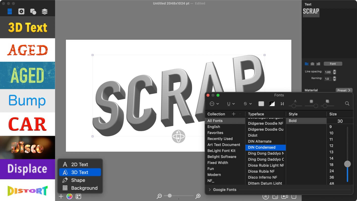
Adding 3D Text
Begin by adding plain 3D text to your document. Change the word to SCRAP using the Text tab in the Inspector panel. Switch the font to DIN Condensed and adjust the Kerning to space the letters a bit more.
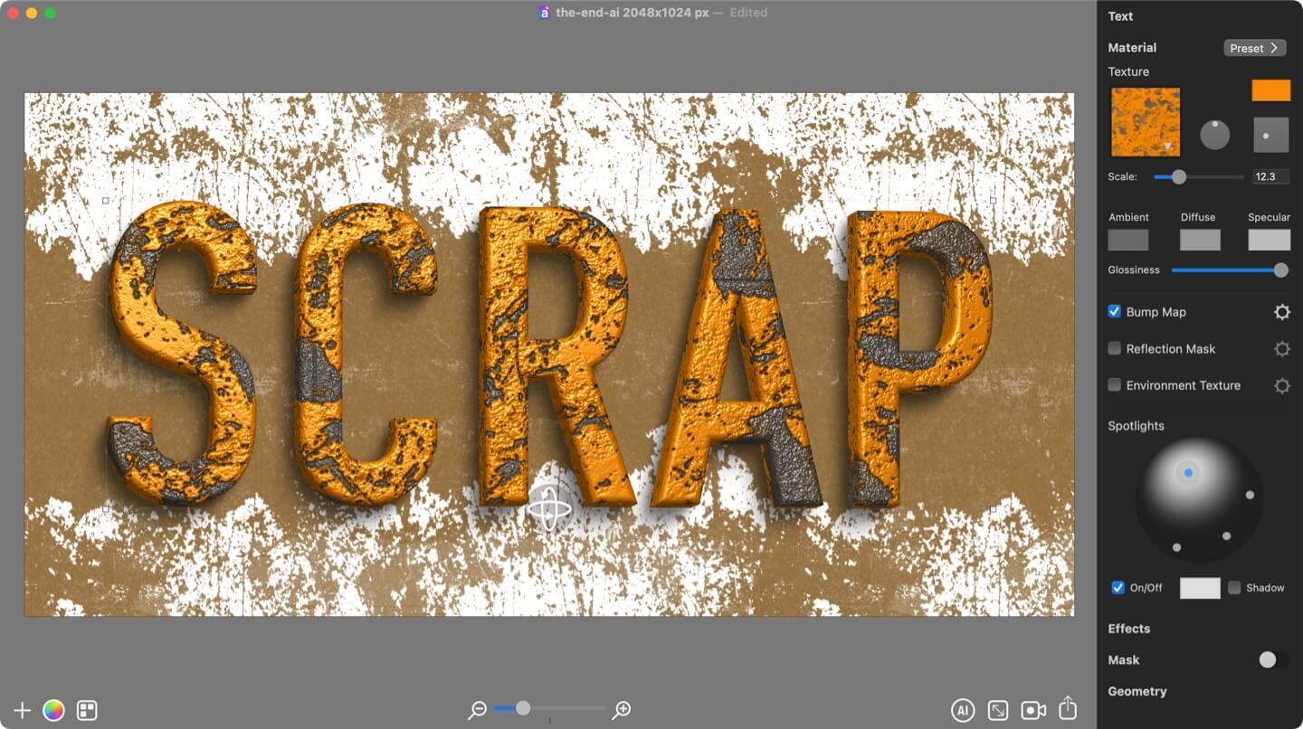
Customize 3D Material
Next, open the Material tab and apply the Grunge 1 texture. Make sure the Bump Map option is enabled, this allows you to control how rough and deep the surface looks. You can adjust the bump strength until you get a texture that feels convincingly corroded.
You can also adjust the spotlights in your scene to enhance the material appearance across the rusty surface.
Applying Shadow
To add more depth, go to the Effects tab and enable the Shadow. Position it and adjust Attenuation and Blur, so that shadow falls the way you want.
3D Text Positioning
Switch to the Geometry tab to refine the text shape. Apply a transformation that lets the letters rotate slightly along the vertical center. You can also tilt or turn the text in 3D space. If needed, move the Projection slider to the right to tweak the overall perspective.
Working With Background
A rusty text effect looks best with a complementary background. Apply one of the Grunge Masks to the background layer, then scale and move it into place. This will give your design the gritty, weathered feel of a scrapyard or post-apocalyptic wasteland.
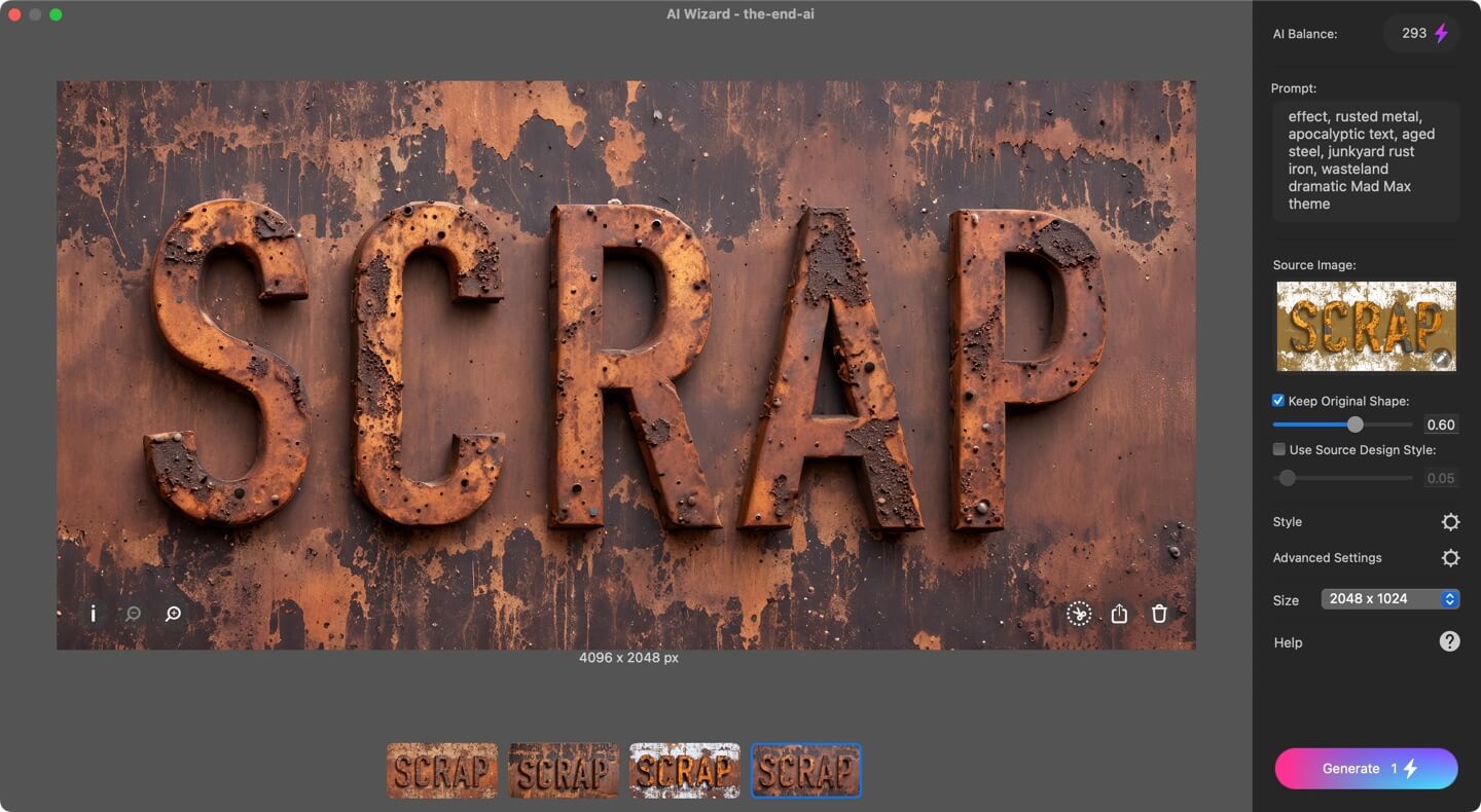
Setting Up the Generative AI
Now for the most exciting part, enhancing the design with the AI Wizard.
Enter a short prompt that describes the effect you want, separating ideas with commas.
Sample prompt:
Rust punk metal text effect, rusted metal, apocalyptic text, aged steel, junkyard trust iron, wasteland dramatic Mad Max theme
Unlike other tools, Art Text AI doesn’t rely solely on prompts, it can also use the shapes, layout and colors of your design as guidance.
Set the Keep Original Shape slider to around 0.6. This ensures the letters remain recognizable while still allowing the AI to add detail. Avoid values below 0.4, as they may make the text hard to read.
Leave the Use Source Design Style option unchecked so the AI has freedom to generate new color mixes and textures.
For better accuracy, add a negative prompt from the Advanced Settings, describing what you don’t want to see in the generated image, for example:
Dull, blurry, pale, dark
Then enable Universal Control and Contour Control options.
Click Generate, and within a minute you’ll have a striking apocalyptic rust metal text effect.
For a variation, try enabling Use Source Design Style and lowering it to 0.1. This gives the AI more creative freedom while keeping the result similar to your source text design, but with added realism and incredible detail.