Art Text 4
Graphic design software for transforming any letter, word or text into a masterpiece on your Mac.
Free Download
It will not be absurd to refer to fonts as the backbone of a text. Design, style and size are the essential characteristics that differentiate fonts. There are countless options of fonts for typographical use, and one can choose a font per the requirements of a specific task.
Fonts are the characters that can be used in a displayable and printable typographical format. The history of fonts dates back to the 12th century when the Western European region used Gothic script, and Blackletter is the oldest known font in the typography history of humankind. In terms of etymology, it is also referred to by the names Gothic, Old English, or Fraktur.
The Blackletter font was used in the early 12th century in the Western European region. Blackletter font was adopted by several Danish, Swedish, Norwegian, and German languages. This font was excessively used till 1940 in the German language and was discontinued in 1941 on the directions of Hitler as he had a distaste for the Jewish influence of the font.
Currently, Microsoft Word is the most widely used application for typographical purposes, and there are a bunch of 700 different fonts having distinctive styles, designs, and sizes. The revolution in fonts is a continual process, and new ones are created daily.
Let’s have a bird’s eye view of some of the most popular fonts of this era.
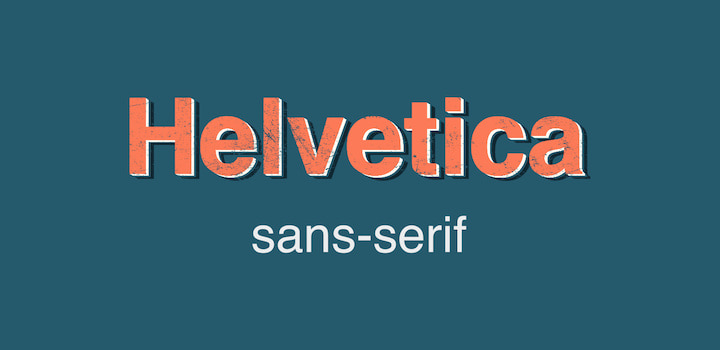
Swiss typeface designers Max Miedinger and Eduard Hoffmann have the honor of developing Helvetica, a sans-serif typeface developed in 1957. This font has a neo-grotesque design that signifies the absence of extended features after strokes called serifs. Thus giving the typeface its type—sans-serif meaning “without any extensions.”
Helvetica is regarded as the celebrity of the font’s world. It is widely used in clothing, logo design, posters, and signboards, owing to its neutrality. If you look around, you will find this font everywhere.
Helvetica is one of the most dominant fonts in the typographical realm because of its simplicity and clarity. It has been used in the logo designs of many leading corporations such as Apple, BMW, Target, Kawasaki, Jeep, Skype, Panasonic, and Verizon.
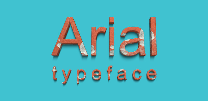
The origin of Arial (a sans-serif font) goes back to 1982, when it was designed by Patricia Saunders and Robin Nicholas for Monotype Typography. Since its release, it has been used and is considered very close to Helvetica in terms of design and weight. An Arial font differs from Helvetica slightly in the design of curves. The curves of characters have been kept more contemporary, and the rounded figure characters have been maintained. That design aspect will differentiate an Arial font from a Helvetica one.
Arial has been the default typeface for Microsoft products up until 2007. After 2007, the Microsoft corporation replaced Arial with Calibri as the default font for Microsoft Office, PowerPoint, Excel, and Outlook. Many critics attributed this font transition of Microsoft to an attempt to avoid the royalty fees of the Arial font.
Despite being discarded as a default font from Microsoft, it is still widely used. Arial font finds its most applications in business-related typographical work such as presentations, emails, office memos, assignments, and faxes. It is not used for posters and signboards in printed form.
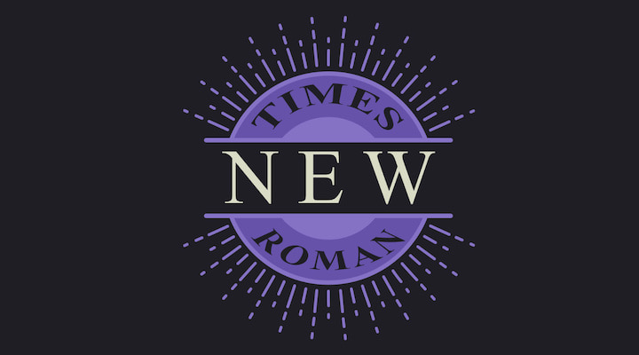
Times New Roman is a serif font founded by the British newspaper Times of London. The Times of London tasked Stanley Morison to create a new and unique typeface for newspapers in 1929. Stanley worked as the lead supervisor of this creation with Victor Lardent, a lettering artist of the Times of London at that time.
Together, these two men created Times New Roman in 1932, released in 1933 for general use. Times New Roman adopted a serif design in which there is a small extension at the end of every significant character, opposite to that of sans-serif. Furthermore, the narrower characters of Times New Roman made it perfectly viable for newspapers.
Times New Roman is widely used in newspaper and printing press works because of the ease in readability with the serif-based design. It is best used for those typographical works where you wish to cover more content in smaller paper space.
Franklin Gothic was designed in the early 20th century by the American Type Founders (ATF). It is a sans-serif typeface with a broader character design. It is regarded as a baseline typeface for future fonts. It is an extra-bold typeface.
Having boldness in its character design, this font is used in advertisements and newspaper headlines.
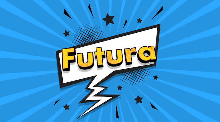
Paul Renner, the German typeface designer, holds the honor of creating the Futura font in 1924. Futura font was released by Bauer Foundry in 1927 and was referred to as the “font of the future.” It has design similarities with the Blackletter typeface.
Futura typeface is widely used in advertising, art, and logos. Due to its clarity aspect, it is commonly used in the art sector.
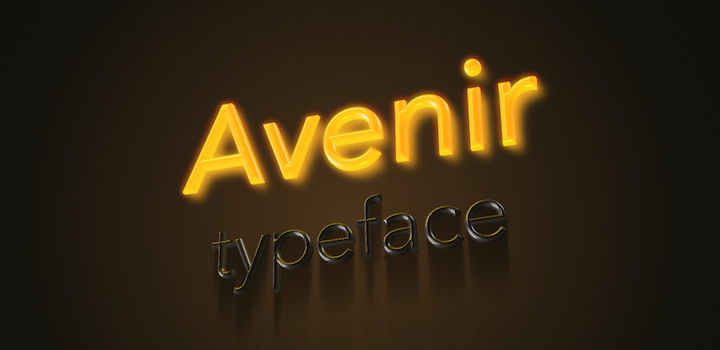
Avenir was developed in 1987 by Adrian Frutiger and was released in 1988. It is based on the design spectrum of Futura and has a geometrical illustration of the sans-serif font style. The primary design aspect of this font is that it has a suitable distribution of height and thickness of characters.
Avenir is used widely in advertisements. Furthermore, it is also used as a branding typeface for many leading brands, for example LG electronics. Moreover, it is also used for articulating public notices at the airports, rail terminals, and other similar spaces.
Calibri is the digital font (sans-serif) and is also the pioneer of a digital typeface. It was designed by Lucas de Groot somewhere between 2002 and 2004. However, it was available to the public in early 2007.
Microsoft has the distinctive honor of releasing Calibri font with the launch of Microsoft Office 2007 and Microsoft Vista, and it has been the default typeface for Microsoft applications since 2007. The rounded stems of the Calibri font are the critical design factor as they will increase the readability.
Calibri type is widely used in official documentation and was a cornerstone of a corruption case against the Pakistani Prime Minister, who used the font on counterfeit documents dated before the font’s public release.
Cambria was designed by Dutch typographical designer Jelle Bosma in 2004, and it was launched to the public by Microsoft in 2007. The design spectrum of this typeface has strong diagonal and vertical lines within the characters.
Cambria font is mainly used in academic writing, assignments, and other educational documents. Moreover, electronic gadgets such as TV sets use the Cambria typeface.
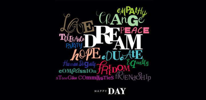
Typefaces play an immense role in graphic design and typography work. Every font has its unique use and is designated for a specific task. The fonts mentioned above are the most widely used in the modern typographical world. Each font has its particular importance and appeal. Designers create text effects that brighten up fonts to make texts and headings more attractive to the reader and get their attention. Art Text is one of these apps that help create text effects and typography graphics with ease.
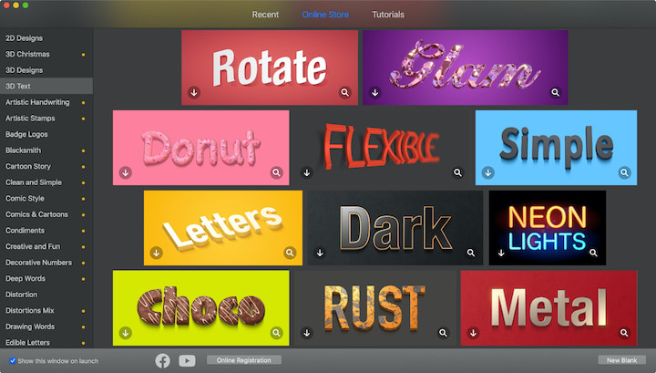
Art Text has over 450 typography templates ready for immediate use with your fonts. Or, you can use design tools to create custom 2D and 3D text effects.