Typeface vs. Font
The fundamental distinction between these two phrases is that a typeface (or type family) is designated to a connected group of fonts. On the other hand, font relates to the weight, breadth, and style of a typeface. A font is any variant of a typeface.
People often use the terms “typeface” and “font” interchangeably. However, they relate to two separate entities. A font refers to variants of a typeface, such as its size and weight, whereas a typeface means a particular style of letters. The most straightforward approach to grasping this distinction is to consider a typeface as a collection of fonts with similar visual features.
Typeface Classification
In most cases, what we frequently inaccurately term “a font” is a typeface. For example, Times New Roman, Helvetica, and Arial are typefaces, not fonts. On the contrary, Times New Roman Regular, Helvetica Light and Arial Bold are exactly fonts. A font is a collection of design elements that define a specific style of letters. This might include things like the existence (or absence) of a serif, the relative height, spacing, and thickness of the letters, and any other visual flourishes. There are several types of typeface classifications.
Serif
Serifs, which are little extensions attached to the endpoints of a stroke, are used in these typefaces. This style evokes a classy vibe in website design. It was created in 1932 for The Times of London newspaper and is both timeless and legible.
It is still extensively used in print and online websites nowadays. You may have seen it as the standard typeface in earlier Microsoft Word versions. Times New Roman is undoubtedly the most well-known serif typeface.
Sans Serif
The sans serif is the second typeface type. As the name implies, these are styles lacking the fringes at the end of a stroke. Although this design emerged in the 1800s, it was not extensively adopted until the 1920s and 1930s, when the Bauhaus movement adopted sans serif fonts as a response to the more decorative Art Nouveau typefaces.
Its enduring popularity stems from its delightfully clean, simple, and unadorned, with a more relaxed and informal vibe than serifs. Helvetica and Open Sans are the two most common examples of this typeface classification.
Script
The script typeface is supposed to resemble cursive handwriting. Clattering, a casual brushstroke typeface, and Barcelony, an exquisite signature-style script, are among the unique designs in this classification.
Script typefaces are inspired by handwriting’s diverse and frequently flowing strokes. They’re more commonly employed for display or trade printing than for content. If the letters are meant to connect up and fluctuate like handwriting, script fonts impose special demands on printing technology. Pacifico and Lobster are the top two examples of script typefaces.
Monospaced
A monospaced typeface is a specific design in which all letters have the same width design space (width or fixed-width). A monospaced typeface, also known as a fixed-pitch font, or non-proportional font, is a unique design in which each letter and character takes up the same horizontal space.
In contrast, variable-width typefaces have varying letter and spacing widths. People used monospaced typefaces in early communication and computing interfaces, which had restricted graphical capabilities. Monospaced typefaces include Courier and Prestige Elite.
Display
A display typeface is designed for headlines in big sizes rather than for long sections of body text. Display typefaces are sometimes quirkier and more diverse in design than body text types, usually plain and conservative. Highway Gothic, Transport, and Clearview are the top examples of display typefaces.
Typeface Terminology
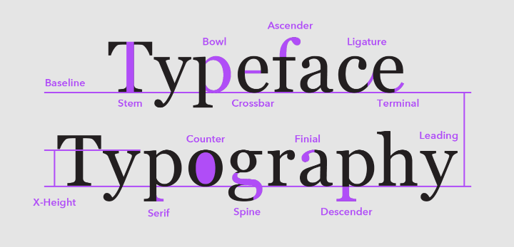
- Baseline: This is the invisible line on which all letters and other elements are placed in any row.
- X-Height: This is the elevation of lowercase letters in a typeface, excluding ascenders and descenders.
- Bowl: This is the completely closed, curved portion of any letter.
- Serif: This is the tiny stroke at the start or end of a letter’s primary strokes.
- Descender: Lowercase letter portions that protrude below the baseline are described as descenders.
- Ligature: A ligature happens when more than one letter is linked together to make a single character.
- Stem: This is the vertical stroke in any character.
- Spine: This is the primary curve in “S.”
- Ascender: This vertical line continues over the x-height on lowercase letters.
- Crossbar: This horizontal stroke appears amid the letters “H,” “A,” and “e.”
- Counter: This is the portion of a letterform or symbol, such as an “o,” “p,” or “c,” partially or encased in a letterform or symbol.
- Finial: Finial is the tapering or curved end on letters like the bottom of a “c” or “e,” or the apex of an “a.”
- Terminal: Terminal is the end of any stroke without a serif.
- Leading: The vertical gap between each row of type is referred to as leading. The name comes from the days of mechanical typography when lead strips were employed to divide lines of text.
- Kerning: The act of changing the space between letters, especially between words, to make a harmonic pairing is referred to as Kerning.
- Tracking: The amount of space among letters in a whole word or sentence is referred to as tracking. It’s a computer word for what is commonly known as letter spacing.
Why Is Typography Important?
A distinctive, uniform typeface can help you develop a strong brand visually, grow your user base, generate trust, and take your image forward. The way readers view and comprehend the information in a text is greatly influenced by typography. Strong typefaces that support the text’s meaning are far more convincing than weak fonts that don’t.
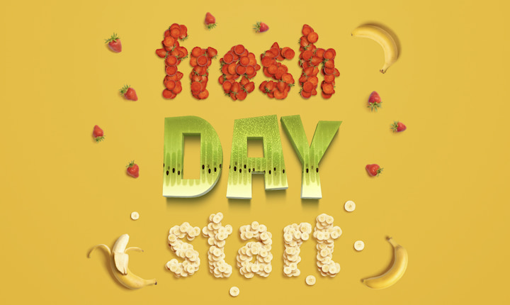
Typography is so much more than just selecting pretty fonts: it’s an important part of user interfaces. Good typography will create a powerful visual presentation, give the website an aesthetic harmony, and determine the overall tone of the offering. Your typography will direct and enlighten your users, improve legibility and accessibility, and provide a positive user experience.
