Imagery
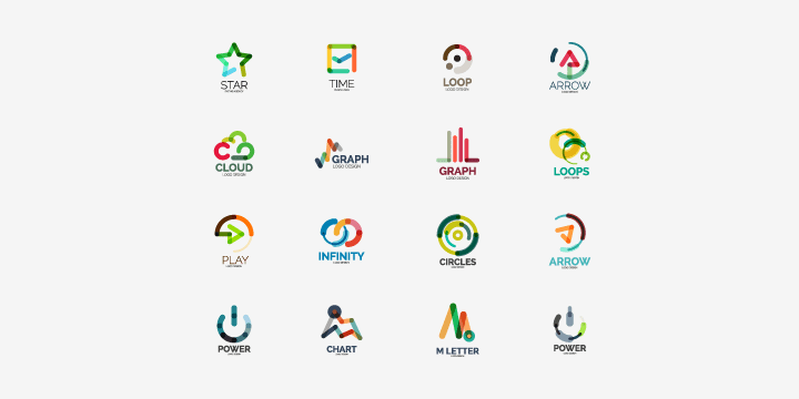
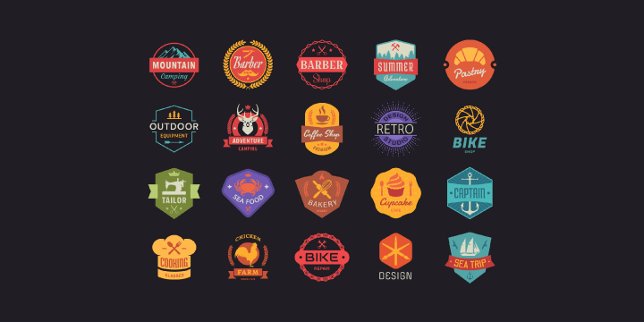
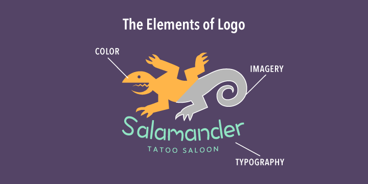
The imagery of your logo allows people to easily recognize your company or organization, whether they see it on a letterhead, brochure, online or on a sign. It should be completely unique so that it can be recognized immediately at first glance. A simple image can communicate a message, an attitude, an emotion or a feeling.
Сonsciously or subconsciously, a potential customer assesses whether the product or service aligns with their preferences. And they will respond in kind if they have a positive or negative reaction to the image of a product. The brand image should support the brand persona and convey a mood or a message to your audience.

Some options to choose from when considering the mood for your brand are traditional, modern, classic, casual, sophisticated or sensual. Some themes could be geometric, tech, minimal, black & white or vintage. You might want to create a mood board in order to see what could work best for the image you are trying to create.
Typography
When creating your logo, it’s best to add a subtle touch that will make it completely unique and stand out from your competitors. A slightly different line or mark in the letter A or E, for example, will make it look more original and memorable.
Kerning, the spacing you put between the individual letters, also makes an impact on the logo design. It’s best to play around with the values, decreasing or increasing the space, to suit the brand of the logo design. Try to keep the logo visually appealing, but also make sure it is legible.

Font choice can be tricky. You can either design a typeface from scratch or use an existing font. When opting for an existing font, you can either purchase the license or use a font that is free for commercial use. Think about the brand identity and the feeling or mood of the company. It’s a good idea to experiment using an app such as Art Text, which not only allows you to try out the different fonts available, but also to apply various text effects to match your company’s identity to your logo style.
Color
Most people make up their minds whether they like a design or not based on the color palette alone. That’s why choosing an appropriate color for a logo is so crucial. Looking at the industry your client is in should give you a good idea what the competition is doing. Think about the tone of the brand; is it playful or serious? Playful brands might require vibrant colors, while serious ones should include more neutral tones. The value of the color indicates whether the brand is economical or luxurious. Luxury can be conveyed with gold, purple or black tones.

What kind of energy does your brand display? Is it loud or is it calm? The color choices will stem from the personality of each of these qualities. You shouldn’t just arbitrarily choose a color because you like it. Instead, you should research what types of colors match with products or services you’re selling.
Look for keywords related to the company, such as strong, natural, stable or confident, and see where these keywords fit into the color spectrum.
Here are a few examples:
- Green represents natural and healthy products.
- Orange represents vitality, fun and change.
- Red conjures up something aggressive, powerful, provocative or energetic. It’s very attention-grabbing.
- Purple gives the impression of royalty, mystery, sophistication, nostalgia and spirituality.
- Blue is the most popular color for a logo. Using a lot of blue conveys positive feelings, like trust and security, which institutions like banks prefer.
- Yellow is seen as a very positive color, associated with motivation, fun, creativity and warmth.
- Brown isn’t used very often, except when associated with chocolate. Brown is also the color of nature and durability.
- Black is a very common color for logos, conveying prestige, value, timelessness and sophistication.
- White in western culture indicates purity, nobility, cleanliness and softness, and is often used with black.

The first step in choosing your brand color is to choose the primary, dominant color, which will establish the mood of the brand. The secondary color can be easily chosen from the opposite end of the color wheel. It’s important to have a good contrast between the primary and secondary color for the colors to stand out.
Tips on Creating an Effective Logo
For most companies, their logo is the face and the first thing that a customer will see, so it’s important that it connects with its audience. You need to keep in mind who the logo is intended for, whether it’s a classic, high-end product or something young, funky and energetic. One mistake many people make is to think that the logo must include what the company sells, like a picture of a dog for dog food, for example. Don’t be afraid to go abstract when designing your logo, and try to be unique and have your logo image be identifiable.

You also want to be sure your logo is versatile, so you can use it in many formats that can be equally successful for print, the web, social media, etc. Consider different layout options, like black & white options and vertical or horizontal versions.
It’s important that your logo can be scaled way up for large billboards, for example, or way down to a very small scale, yet still be recognizable. If you can do that, then it generally means that you have a good logo design.
You’ll also want to keep your logo simple and uncluttered. You should make sure it keeps a balance and not over the top with ornate details.
