Origin of Glitch Typography
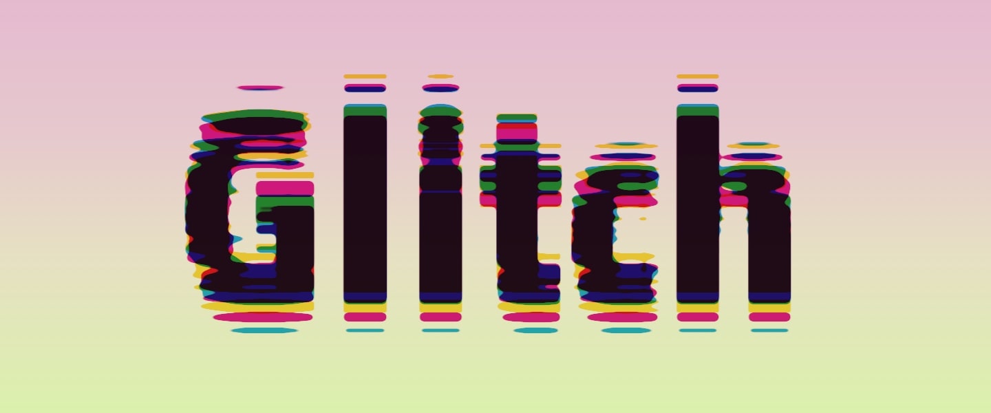
Glitch typography has emerged as one of the most recent typography trends. It is not just about text that appears distorted or malfunctioning; it’s an intentional, creative departure from the traditional, polished fonts that have dominated the design landscape for decades. Glitch typography thrives on unpredictability, celebrating imperfections, and embracing the chaos of the digital realm.
Glitch typography’s essence is in the desire to challenge traditional design norms. Like glitch art in general, glitch typography originated as a part of the broader movement that explored the aesthetics of digital errors and imperfections. It gained prominence in the late 20th century with the rise of computer design. Glitch text effect is often used in various digital art forms, web design, and multimedia.
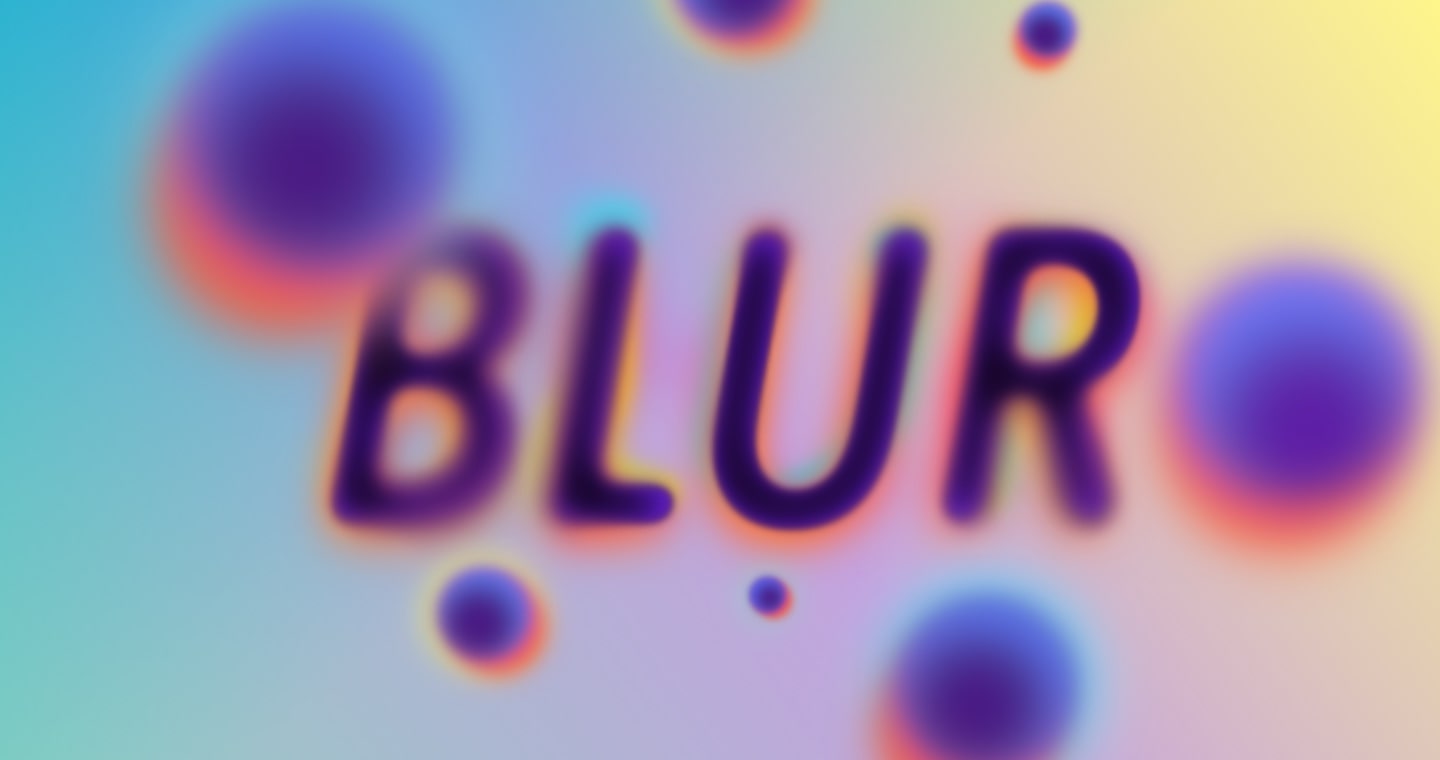
Blur Glitch
Blur glitch typography is a captivating and innovative subgenre within glitch typography. It provides a unique twist by introducing deliberate blur as a prominent text effect. Designers harness the power of blur to impose a sense of mystery, complexity, and emotion in typography graphics.
Shape Glitch
With shape-based glitch typography, designers intentionally manipulate the character outlines and font structures to create a variety of text distortions. This can include stretching, warping, fragmenting, or distorting the edges of letterforms. The result is a text effect that appears to be wobbly and in a constant state of transformation as if the characters are undergoing a visual metamorphosis.
Color Glitch
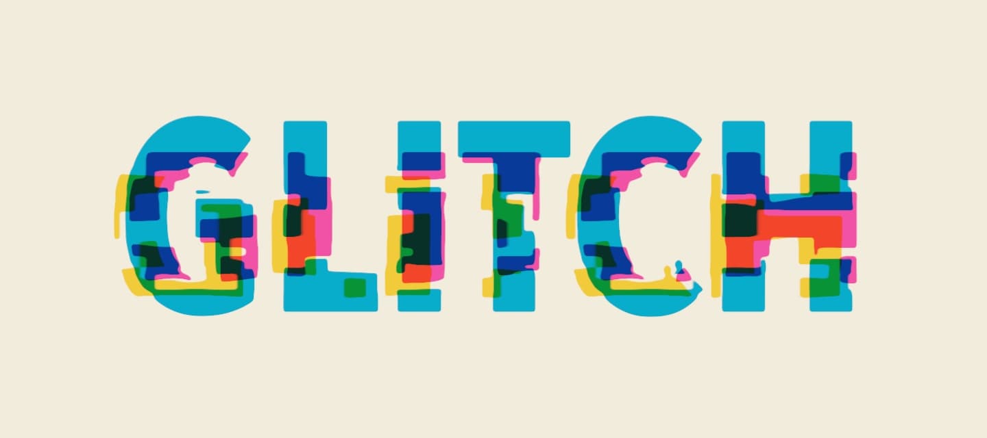
Color glitch typography is a striking and visually captivating subset of glitch typography that focuses on manipulating colors within text to create a chaotic, unexpected, and mesmerizing aesthetic. Unlike traditional typography, where color is applied consistently and harmoniously, color glitch typography revels in disrupting this uniformity. Color glitch typography has found its place in diverse creative fields, from digital art and web design to advertising and branding.
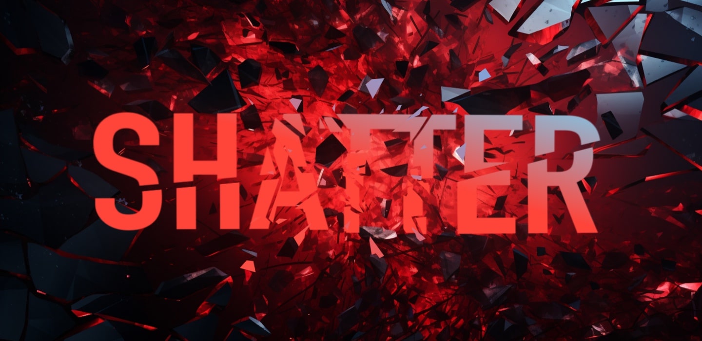
Scratch Glitch
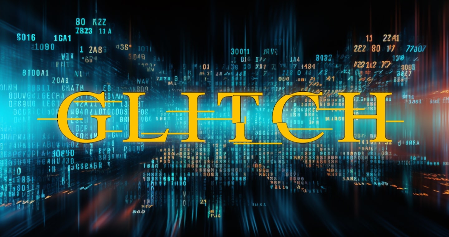
Scratch glitch typography is a captivating theme within glitch typography. It is known for its distinct use of scratch-like elements to create a text effect that appears physically marked or etched. This style deliberately incorporates irregular, scratchy lines, patterns, or shape distortion that disrupt the smooth and pristine appearance of traditional text. The most vivid example of such a text effect is the title of the Matrix movie.
Mixing Glitch Effects
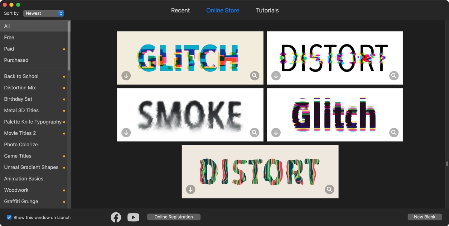
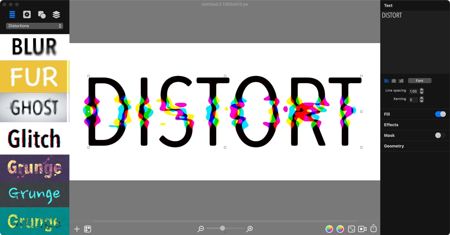
Glitch typography conveys a sense of innovation and experimentation with the purpose of raising curiosity and grabbing attention. You can opt-in for mixing several glitch effects mentioned earlier to enhance the unconventional look of your typography. Graphic design apps like Art Text can help you create mixed text effects, including glitch effects.
Conclusion
Glitch typography is a result of the constantly evolving digital graphics. It has reshaped our perception of what titles can be, celebrating imperfections, embracing unpredictability, and challenging the conventional norms of typography.
Graphic design apps such as Art Text help users easily craft a diverse range of glitch text effects, whether starting from scratch or leveraging pre-designed typography templates that can be instantly tailored to user needs.
