2D Tools and Effects
Applying Materials
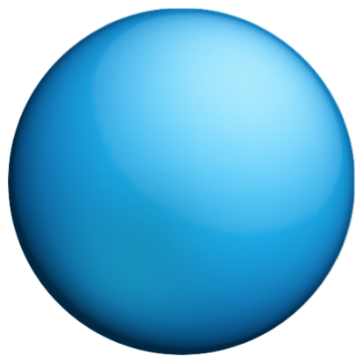
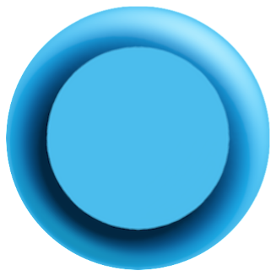
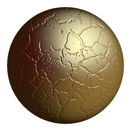
Shading materials are used in Art Text to create 3D looking text and images, to give a glassy, metal, or plastic look to objects, and for other effects.
To open the shading material library, choose Shading in the Fill section.
To apply the effect, click on a shading material preview in the library, and adjust the properties.
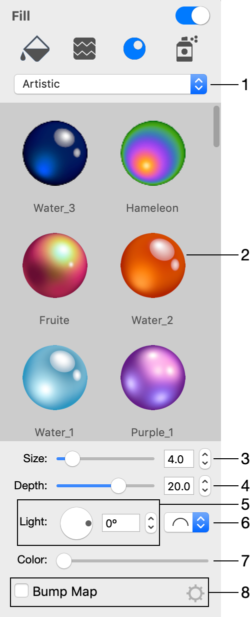
1 - Material categories.
2 - Preview of materials.
3 - Size.
4 - Depth is the amount of the bevel effect.
5 - The angle of the applied effect. For 3D looking objects, this control moves light spots around the center of the object.
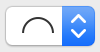
6 - The 3D shape (bevel) selector. It is not available for image-based effects.
7 - The color.
8 - Apply a bump map.
The program creates the 3D effect using the shader technology when the 3D look is generated based upon some color and light spot parameters. Alternatively, the effect can be image-based. This means that an image is used to define light spots and an object's color. Both types of effects are present in the library in separate categories. The majority of items in the library are shader-based.
Materials are usually applied to vector objects. In this case, the effect is applied to the area inside the object's outline. If your object is a raster image, the shader will use the transparency to define the amount of the effect to apply. The more opaque the object parts are, the stronger the 3D effect will be. With no transparency in a raster image, the effect will be applied to the rectangular bound of a raster image instead of the image details.
You can customize materials using The Editor of Materials.
Bevel Shape

Note that straight and concave shapes can produce similar results. They look different with shaders which have a light spot near the center.
Light
The Light control moves the light spots around the center. This lets you change the location of a virtual light source.
When your design consists of several 3D objects, you can adjust the location of light spots as if they appeared from the same light source.
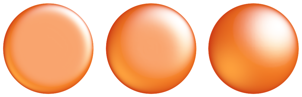
Depth
At lower values, you will get an object looking almost flat. The slider covers the most appropriate range of values 1 - 30. To set greater values, use the edit box. Below, you can see circles with the Depth parameter set to 7, 15 and 30.
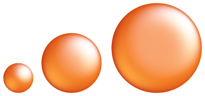
At the same Depth value, the result also depends on the size of the object. At some point, increasing Depth will not change the final image. Small objects can lose a 3D look at values that are too large. This shows how circles of 50x50, 100x100 and 150x150 pixels look at Depth = 15.
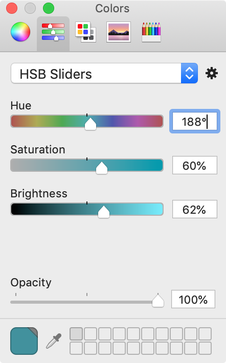
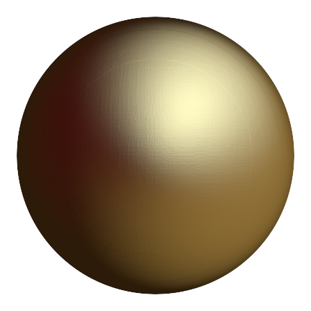
Color
The Color control changes all colors in a way similar to the Hue parameter in the standard Colors panel. Black, white and grayscale colors will stay unchanged.
Bump Map
Shaders create smooth surface by default. You can make it uneven using a bump map.
To apply a bump map, just activate the Bump Map option in the Inspector and choose an image to be used as a bump map.
In order to modify the bump map settings, click on the corresponding gear icon. These settings modify the image before it is used as the bump map.
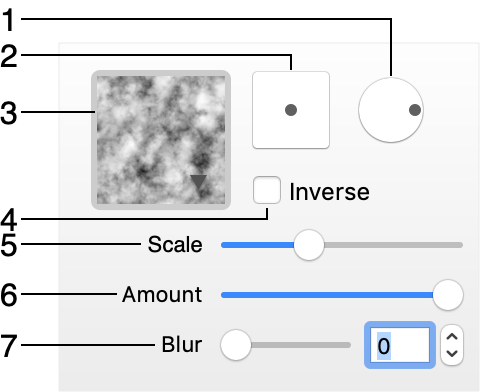
1 - Rotate the bump map.
2 - Offset the bump map in relation to the object.
3 - The library of images that can be used as bump maps. Click on the library to select an image. The drop-down list of image categories has the Custom Folder… at the bottom. You can use it to access your own images.
4 - Inverse the bump map. This option turns protruding areas into depressed ones and vice versa.
5 - Change the scale of the bump map.
6 - Adjust the strength of the effect.
7 - Blur the bump map. Adding blur makes elements created by the bump map more smooth.
Pixel Brightness in a Bump Map
You can use a black and white or grayscale image as a bump map. Darker color in the bump map will create a more depressed area on the object. You can swap the meaning of light and dark colors using the Inverse checkbox.
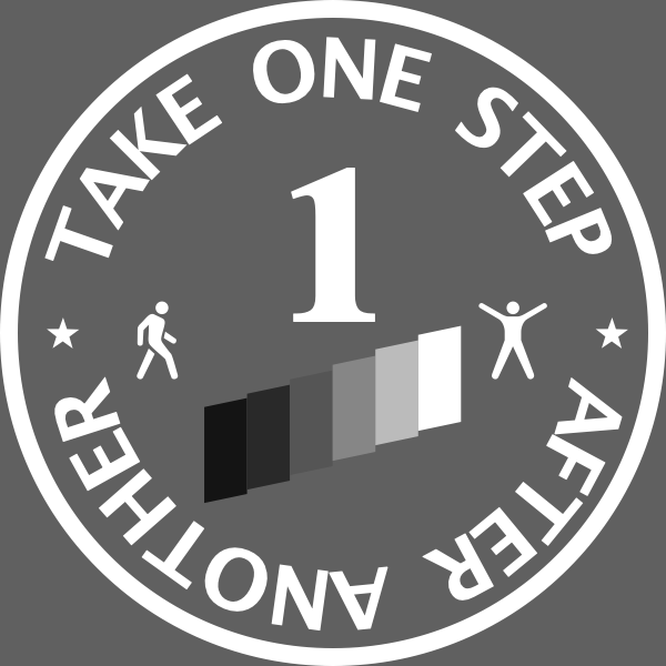
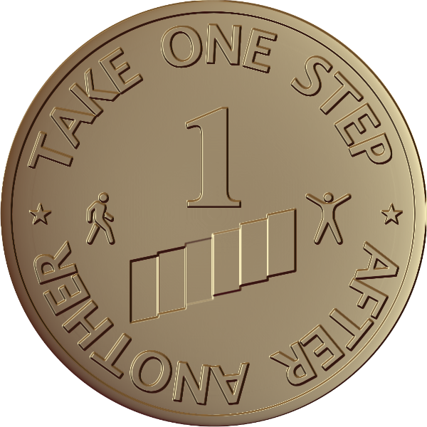
Let's see how the brightness of different parts of the bump map affects the final design. We can take a funny medal as an example.
The bump map (created outside Art Text) has a kind of staircase below the "1". This staircase is actually the key part of the example. Let's take the body of the medal as the base level. Now, we are going to make three stairs on the left depressed, while the other three should look protruding. This effect can be achieved by making the depressed elements darker than the body. The protruding elements should be lighter than the body.
See how the same elements look in the bump map and design.