Exploring the Origins of Logos
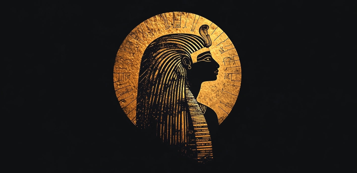
The history of logos dates back thousands of years, rooted in the ancient symbols and emblems used by civilizations to represent authority, religion, and identity. Early examples can be found in Egyptian hieroglyphs, family crests in medieval Europe, and royal seals that marked authenticity and ownership.
In the 19th century, with the rise of the Industrial Revolution and mass production, logos became increasingly important for businesses to stand out in crowded markets. Brands like Coca-Cola and Bass Brewery were among the first to develop iconic logos that are still recognized today.
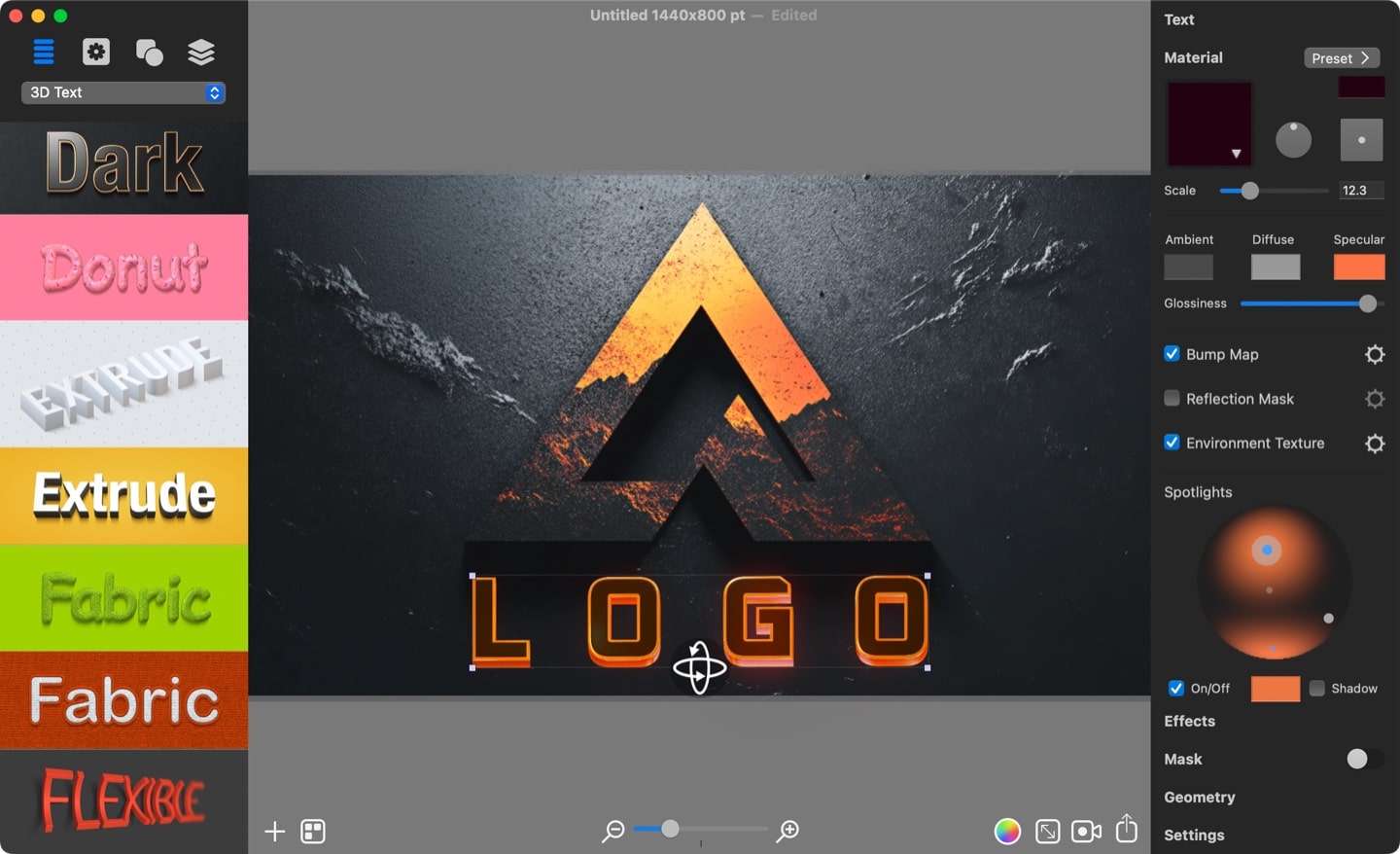
In the 20th century, logo design underwent a significant transformation as businesses sought to establish distinct identities in a rapidly growing era of mass media and advertising. The rise of modern graphic design, coupled with advancements in graphics software like Art Text and vector tools like Amadine, accelerated this evolution. Logos shifted from intricate, detailed illustrations to minimalist, symbolic designs, mirroring the changing aesthetics of each decade. The focus moved toward simplicity, versatility, and memorability, with logos increasingly embracing clean, abstract shapes that could adapt across various platforms and media.
Today, logos are a vital part of branding in the digital age. As companies expand across various platforms—from websites to social media—logos have become even more simplified and adaptable to ensure visibility and recognition across different devices and screen sizes. The history of logos showcases the continuous balance between creativity and practicality, with an ever-present focus on representing a brand’s core values and identity.
Different Types of Logos
Wordmark
A wordmark is a text-based logo that features the brand’s name written in a distinctive font or style. These logos rely heavily on typography to convey the brand’s identity. Famous examples include Google, Coca-Cola, and FedEx.
Best for: Brands with memorable or unique names. It emphasizes the company name in a clear, impactful way.
Lettermark
A lettermark is a typography-based logo that uses initials or a single letter to represent the brand. These are particularly effective for companies with long or complex names, distilling the brand identity into just a few letters. Examples include IBM, CNN, and HBO.
Best for: Companies with lengthy names, or those wanting to create a sleek, modern look.
Pictorial
A pictorial mark is an image-based logo consisting of a symbol or icon that represents the brand. These logos rely on visual recognition, such as Apple’s bitten apple or Twitter’s bird.
Best for: Brands with strong visual identity or those looking to create a universal, memorable icon.
Abstract
An abstract mark uses geometric forms or abstract shapes to create a unique visual that represents the company. These logos are not literal depictions but evoke a feeling or association. Examples include Pepsi and Nike’s swoosh.
Best for: Companies wanting a distinctive, unique image that conveys a broad concept or emotion.
Mascot
A mascot logo features an illustrated character that represents the brand. Often playful and colorful, these logos help create a friendly, approachable brand image. Examples include KFC’s Colonel Sanders and Pringles’ mascot.
Best for: Brands that want to build a more personal, fun, or family-friendly image.
Combination
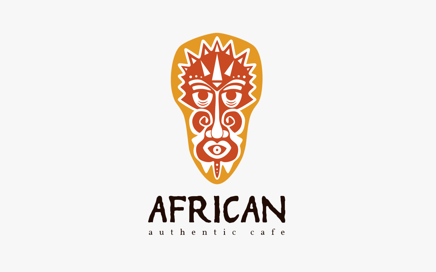
A combination mark combines text and imagery, where both the wordmark (or lettermark) and a symbol are used together. The two elements can be used simultaneously or separately in different contexts. Examples include Burger King, Lacoste, and Doritos.
Best for: Brands that want the flexibility of using both text and a symbol for greater recognition.
Emblem
An emblem logo features text inside a symbol or an icon, creating a badge-like design. These logos often look traditional and can convey a sense of history or trust. Examples include Harley-Davidson and Starbucks.
Best for: Companies that want to project an established, classic, or prestigious image.
Recent Logo Trends
Each type of logo design has its own strengths and best use cases, depending on the brand’s goals, personality, and target audience. The right choice can enhance brand recognition and reinforce the brand message. Below are some examples of recent logo design trends.
Gradient Logos
Gradient logo style uses smooth color transitions to create depth and dimension, making logos vibrant and eye-catching. By blending different hues, gradients add a dynamic feel to simple shapes and designs, giving them a modern and polished look. This style is often used to signify modernity and innovation.

Minimalistic Logos
Minimalist logo design focuses on simplicity, using clean lines, minimal details, and often monochromatic or limited color palettes to convey a brand’s identity with clarity and precision. By stripping away complex elements, minimalistic logos create a strong, lasting impact and are easily recognizable across various platforms and media. The elegance of minimalism lies in its ability to communicate a brand’s essence with only the most essential visual elements, often evoking a modern, professional, and sophisticated feel.
Typography-Driven Logos
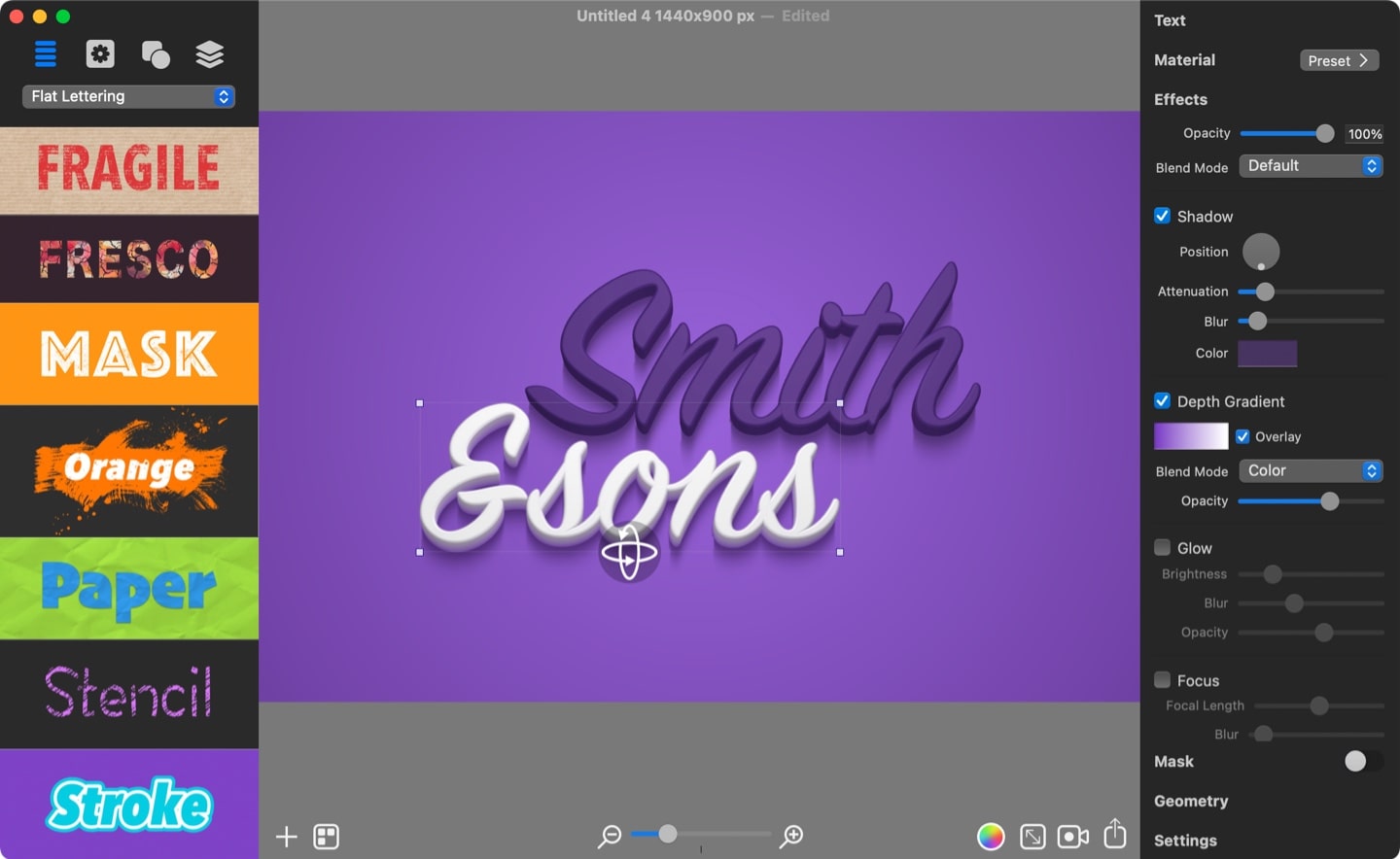
Typography-driven logo style focuses on using custom fonts and text effect as the central design element. It emphasizes creative and unique arrangements of text to convey a brand’s personality and identity, making the text itself the standout feature of the logo.
The Art Text app can be very useful especially for this type of logos by offering an easy way to design custom typography and text effects with ease.
Negative Space Logos
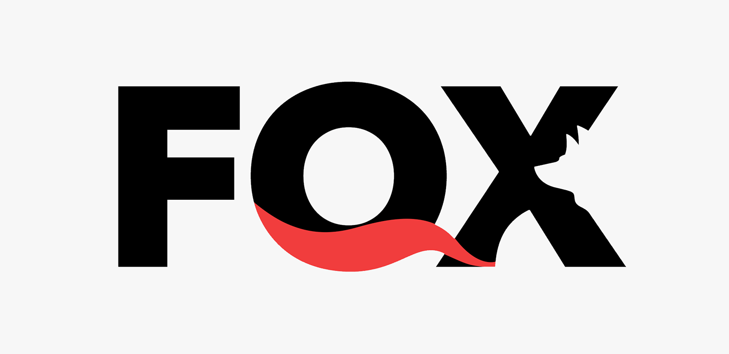
Negative space logo style cleverly uses the empty space around or within design elements to create secondary images or shapes. This approach adds depth and creativity, allowing the viewer to discover hidden meanings or symbols within the logo. It’s a subtle yet powerful way to communicate more with less, often making the design more memorable and impactful.
3D and Isometric Logos
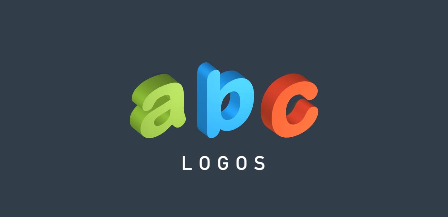
These kinds of logos add depth and dimension to designs, creating a sense of realism and structure. These logos often use shading, gradients, and perspective to give the impression of volume, making the design more dynamic and engaging. The isometric technique offers a balanced, geometric look, while 3D elements create a modern, futuristic feel. This style is perfect for brands aiming for a visually striking and bold identity.
Dynamic and Animated Logos
Dynamic and animated logos bring motion and energy to a brand’s identity, making them more engaging and memorable. These logos use movement, transitions, or even subtle animations to tell a story or emphasize the brand’s personality. Often used in digital platforms such as websites, social media, and apps, animated logos are ideal for tech companies, entertainment brands, and startups seeking to stand out in a crowded online space. This style adds a modern, interactive element that catches attention and leaves a lasting impression.
Conclusion
The logo design landscape is shifting towards adaptability, creativity, and digital-first thinking. Whether through minimalistic designs, bold color choices, or hand-drawn details, brands today are finding ways to express their values and connect with audiences in new and exciting ways.
