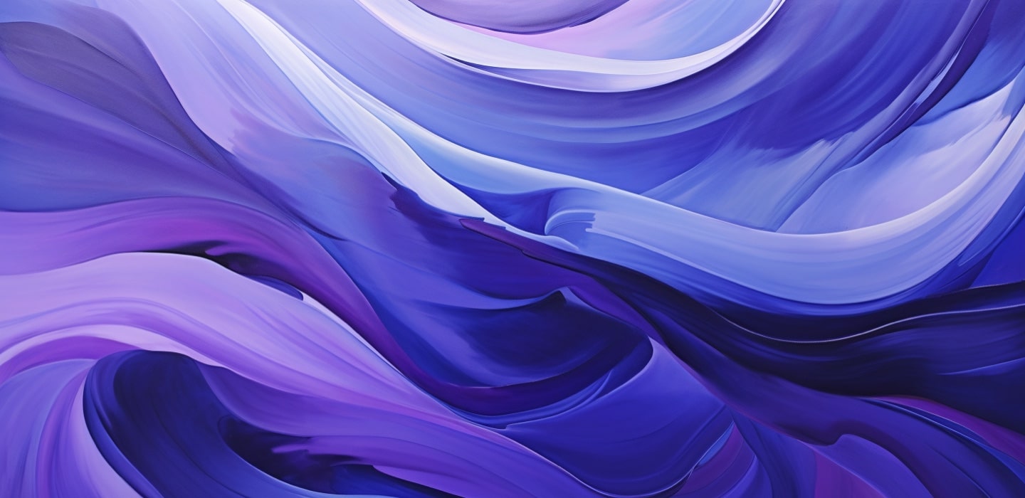
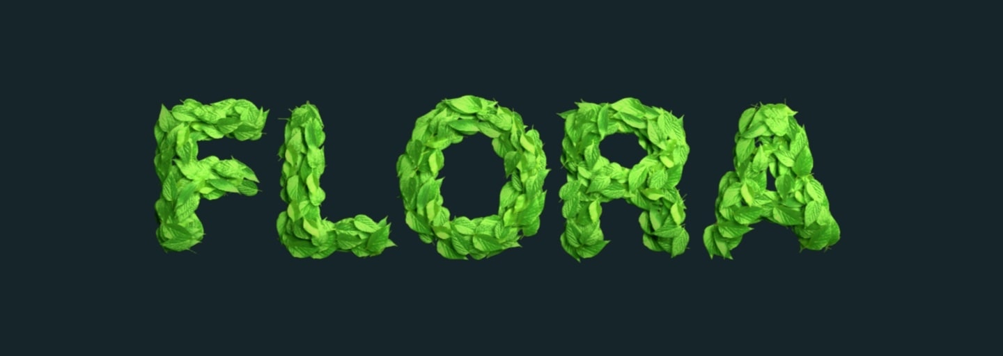
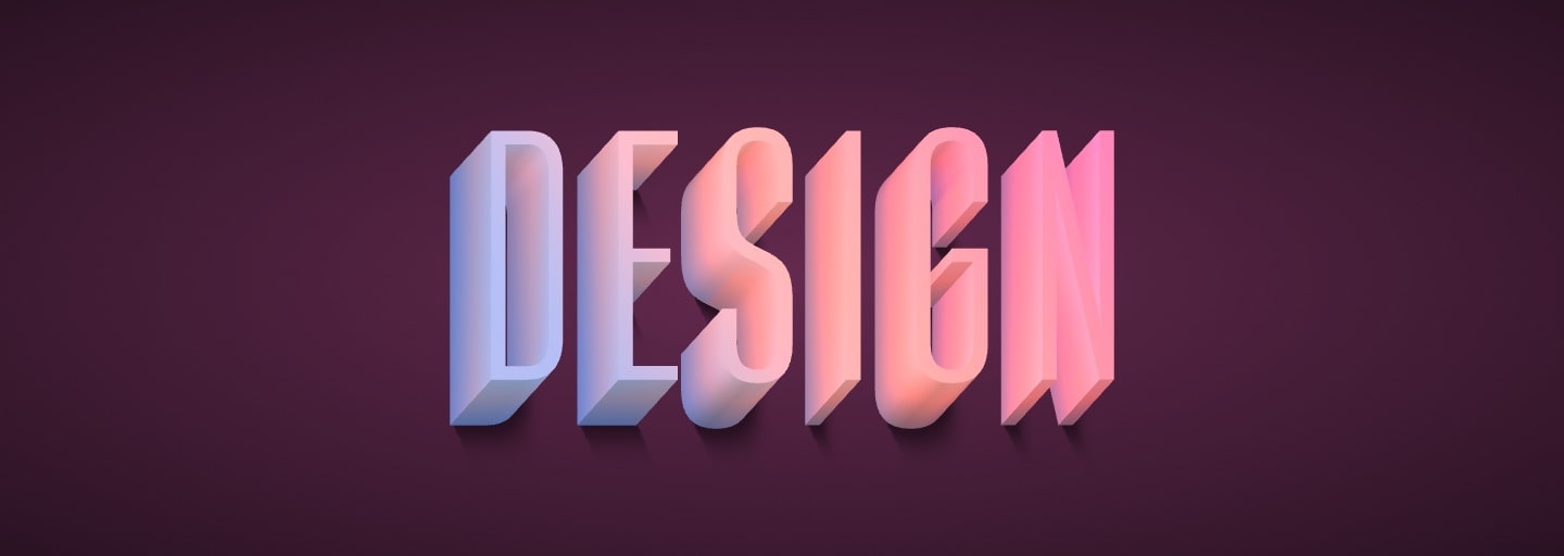
Art Text 4
Graphic design software for transforming any letter, word or text into a masterpiece on your Mac.
Free Download
Pantone is best known for its color matching system (Pantone Matching System). It is a standardized color reproduction system that has become a cornerstone in various industries by helping with color communication and management from design to production, in physical and digital formats. The system is particularly useful in graphic design, printing, manufacturing and fashion. Each color in the Pantone system is meticulously defined by alphanumeric codes, enabling designers, manufacturers, and printers to accurately match and reproduce colors with high consistency across different materials and processes.
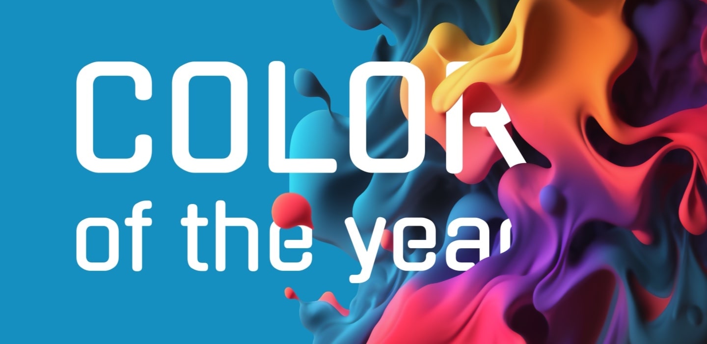
Since 2000, Pantone twice a year gathers various nations’ color standards groups and as a result of their trend analysis and debates, color of the year for the coming year is chosen.
Below we gathered the list of every color of the year that got that nomination.
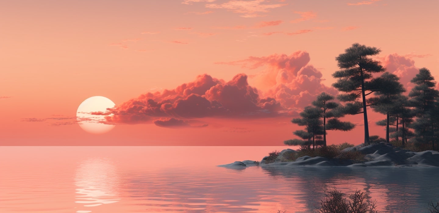
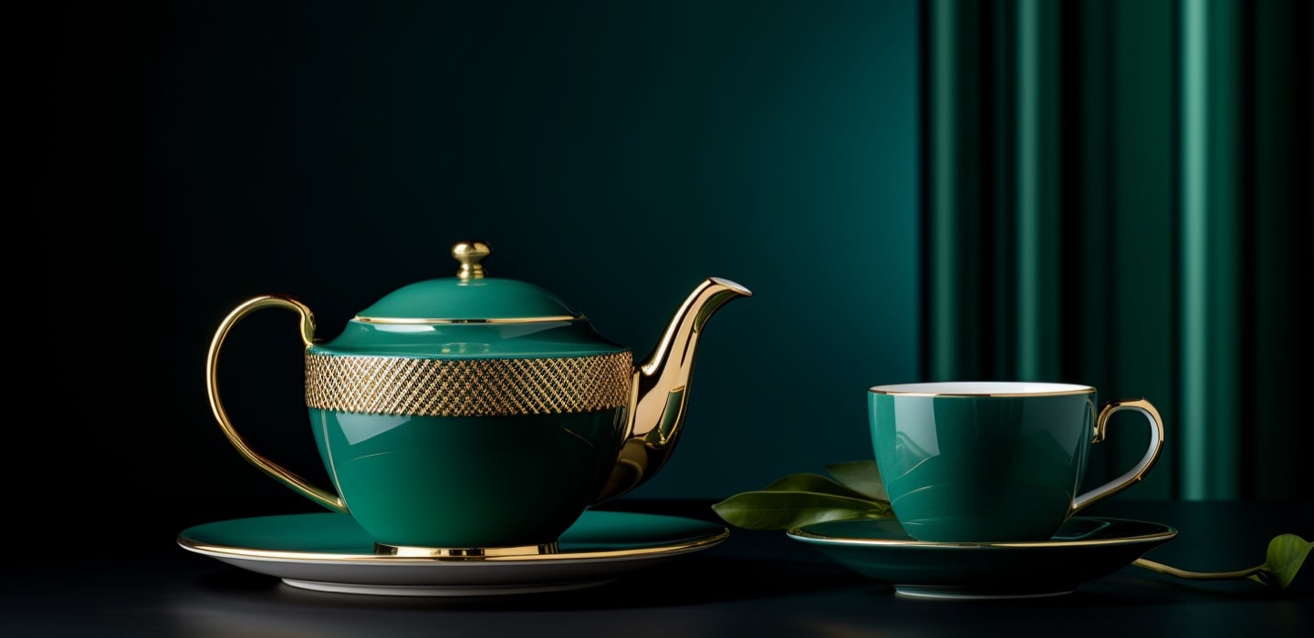
Peach Fuzz is a soft and delicate color that effortlessly captures the essence of ripe peaches at the height of their sweetness. This gentle hue blends subtle tones of pale orange and warm pink, creating a warm and inviting atmosphere.
Reminiscent of a soft sunset glow, Peach Fuzz radiates a sense of tranquility and comfort. Its understated charm makes it an ideal choice for adding a touch of warmth to interior spaces or infusing a hint of softness into fashion and design palettes. The color exudes a timeless and soothing quality, making Peach Fuzz a versatile and appealing choice for those seeking a gentle yet impactful aesthetic.
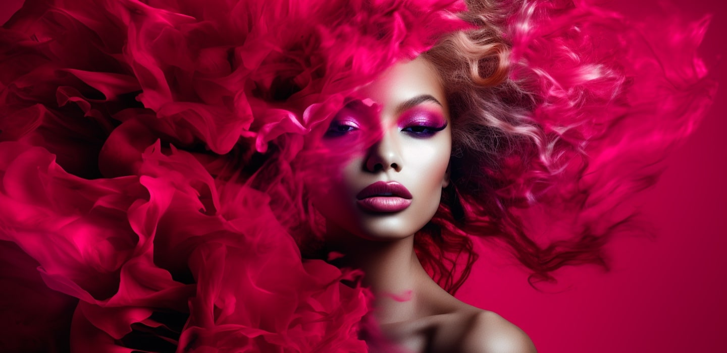
Viva Magenta commands attention with its bold and empowering presence. This bold color joyously embraces experimentation and unrestricted self-expression, radiating electrifying energy. Viva Magenta stands as a rebellious spirit and embodies a vibrant celebration that knows no limits.
As described by Leatrice Eiseman, Executive Director of Pantone Color Institute: “Viva Magenta descends from the red family, and is inspired by the red of cochineal, one of the most precious dyes belonging to the natural dye family as well as one of the strongest and brightest the world has known.”
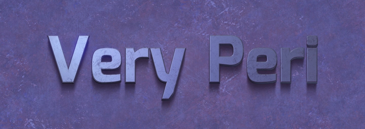
Blending a lavender blue with a violet-red undertone, this dynamic hue seamlessly marries the reliability of blue with the vibrancy of red, creating Very Peri color. The choice of Very Peri as the color of the year mirrors the transformative era we inhabit, symbolizing the convergence of our physical and digital existences.
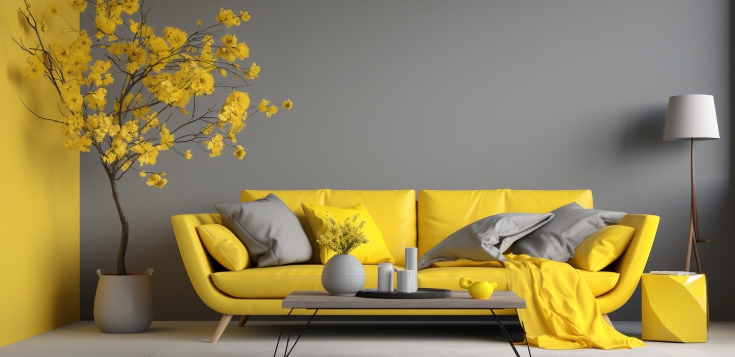
This was the second time Pantone nominated two colors, as the color of the year. Harmonious blend of gray and yellow marked the year 2021. Ultimate Gray color conveys resilience and strength, while Illuminating color brings optimism and vibrancy. Together, they symbolize a union that is both enduring and uplifting, reflecting hope and positivity amid challenges. This unique color pairing encourages a balance between stability and forward-looking optimism.
Classic Blue is a deep shade that exudes tranquility, confidence, and connection. With its rich, calming tones, this hue reminiscent of the evening sky brings a sense of stability and resilience. The dark blue color encourages contemplation and reflection, offering a dependable foundation amid the complexities of modern life. No wonder this color was on its peak during the pandemic. Its universal appeal makes it versatile across various design and creative expressions, making it a color that resonates with a wide audience.
In its nature, Classic Blue serves as a reassuring and enduring presence, inviting a sense of calm and clarity into visual elements.
Living Coral is a vibrant and lively hue that embodies warmth, energy, and optimism. This dynamic shade lies at the intersection of orange and pink, with golden undertones, reminiscent of the vibrant reefs found in the natural world. Living Coral is not only visually appealing but also carries a symbolic significance, representing our connection with nature and the need for environmental preservation.
We find ourselves in an era demanding inventiveness and imagination. Ultra Violet, a blue-based purple, uniquely embodies the creative inspiration needed to elevate our awareness and unlock our potential. It transcends boundaries, fueling exploration in emerging technologies, the vast reaches of the galaxy, as well as fostering artistic expression and spiritual reflection.
In the midst of a turbulent social and political life, Greenery color offers the solace and reassurance we urge for. Addressing our increasing need for renewal and revitalization, this verdant hue serves as a symbol of the reconnection—with nature, and each other. Nurturing evergreens have a calm and soothing effect on an ever-buzzing mind and offer peace amid the hustle and bustle of big city life.
In 2016, Pantone introduced a groundbreaking approach by selecting two colors as the Color of the Year, Rose Quartz and Serenity. This unique pairing represented a harmonious blend that symbolizes order and peace. Rose Quartz, with its gentle and soothing pink, embodied qualities of compassion and warmth, while Serenity, a tranquil blue shade, conveyed a profound sense of calm and relaxation.
The deliberate choice of these complementary colors aimed to evoke a feeling of unity and connection, highlighting the exquisite beauty that emerges when seemingly disparate elements come together.
Marsala captivates with its naturally robust and earthy wine red color. Its warm undertones contribute to its widespread use, it adds a touch of luxury into physical materials and graphic design.
Overall, Marsala’s enduring charm lies in its ability to bring elegance to diverse design sectors, creating a lasting impact in the world of color trends.

Radiant Orchid, is a vibrant hue that exudes confidence and warmth with its expressive and exotic qualities. This captivating shade sits at the crossroads of fuchsia, purple, and pink, creating a visually striking and dynamic color. Its ability to convey both sophistication and playfulness has led to its widespread use in clothing, accessories, home decor, and graphic design.
Emerald is a vibrant and lush green hue that radiates liveliness and energy. This captivating shade, reminiscent of the precious gemstone it’s named after. Its association with nature and luxury contributed to its widespread appeal, allowing designers to infuse a sense of freshness and luxury into their designs.
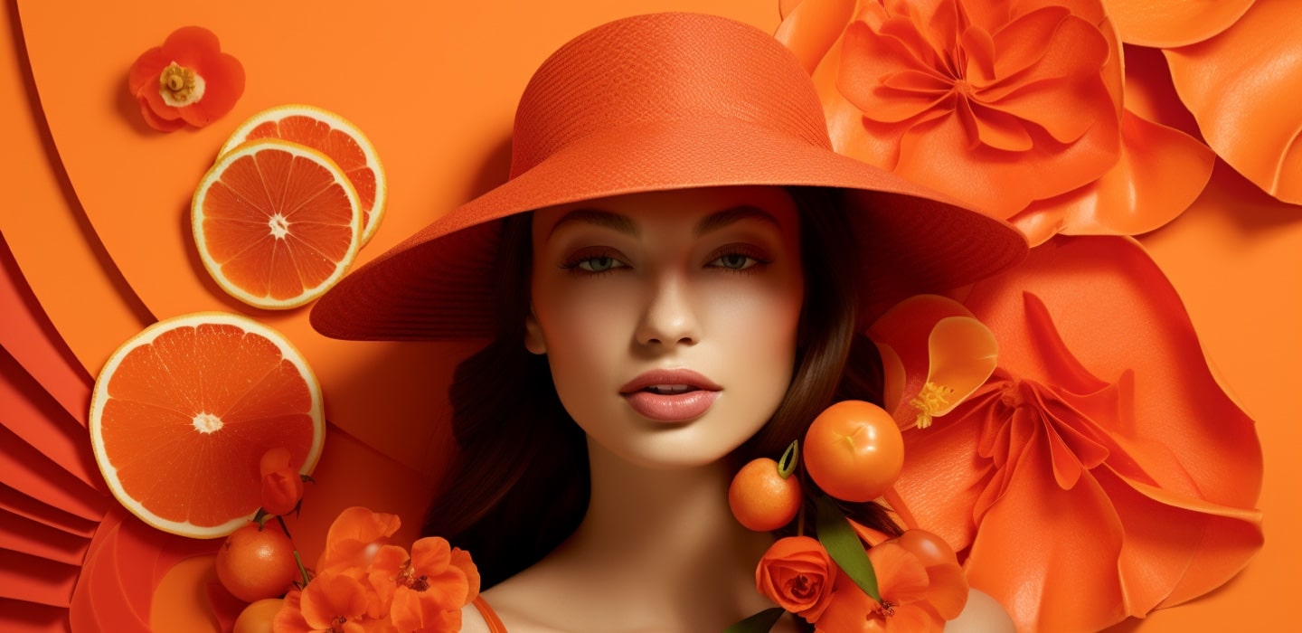
Tangerine Tango invites individuals to dance into the new design with its vivacious and appealing reddish-orange hue. This energetic and warm shade exudes a sense of enthusiasm and creativity. Its dynamic nature and ability to evoke feelings of joy and warmth cemented Tangerine Tango as a memorable and influential сolor.
Honeysuckle is a color for all seasons. This vibrant hue stands out as anything but ordinary, bringing an extraordinary touch to each day. Honeysuckle, with its dynamic and uplifting qualities, transcends the mundane, making it a symbol of resilience and positivity.
Turquoise is the very first Color of the Year nominated by Pantone. It sets the tone for the annual selection, highlighting the significance of color trends in influencing design and aesthetics across various industries. The color, reminiscent of the gemstone, represents a refreshing and invigorating shade that communicates a sense of calm and clarity.