Choosing the Right Typeface
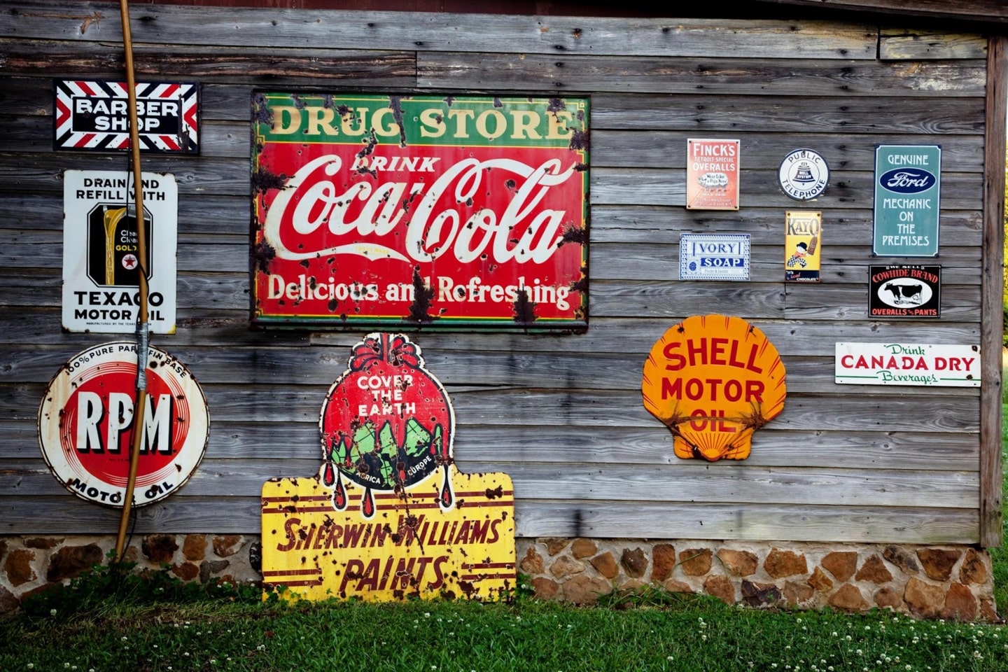
Selecting the right typeface defines a brand’s personality. Serif fonts convey tradition and sophistication, making them ideal for luxury or professional brands. Sans-serif fonts, with their clean, modern look, suit tech companies and contemporary brands.
Script and handwritten fonts introduce elegance and personality, often used by luxury and boutique businesses. Display fonts, bold and unique, create strong brand presence but should be used carefully to maintain readability. Each typeface choice shapes how a brand is perceived and recognized.
If you want to identify the font your competitors are using or have found a typeface you love but don’t know its name, check out our article on the Best Font Finders by Image and URL.
Font Pairing and Balance in Logos
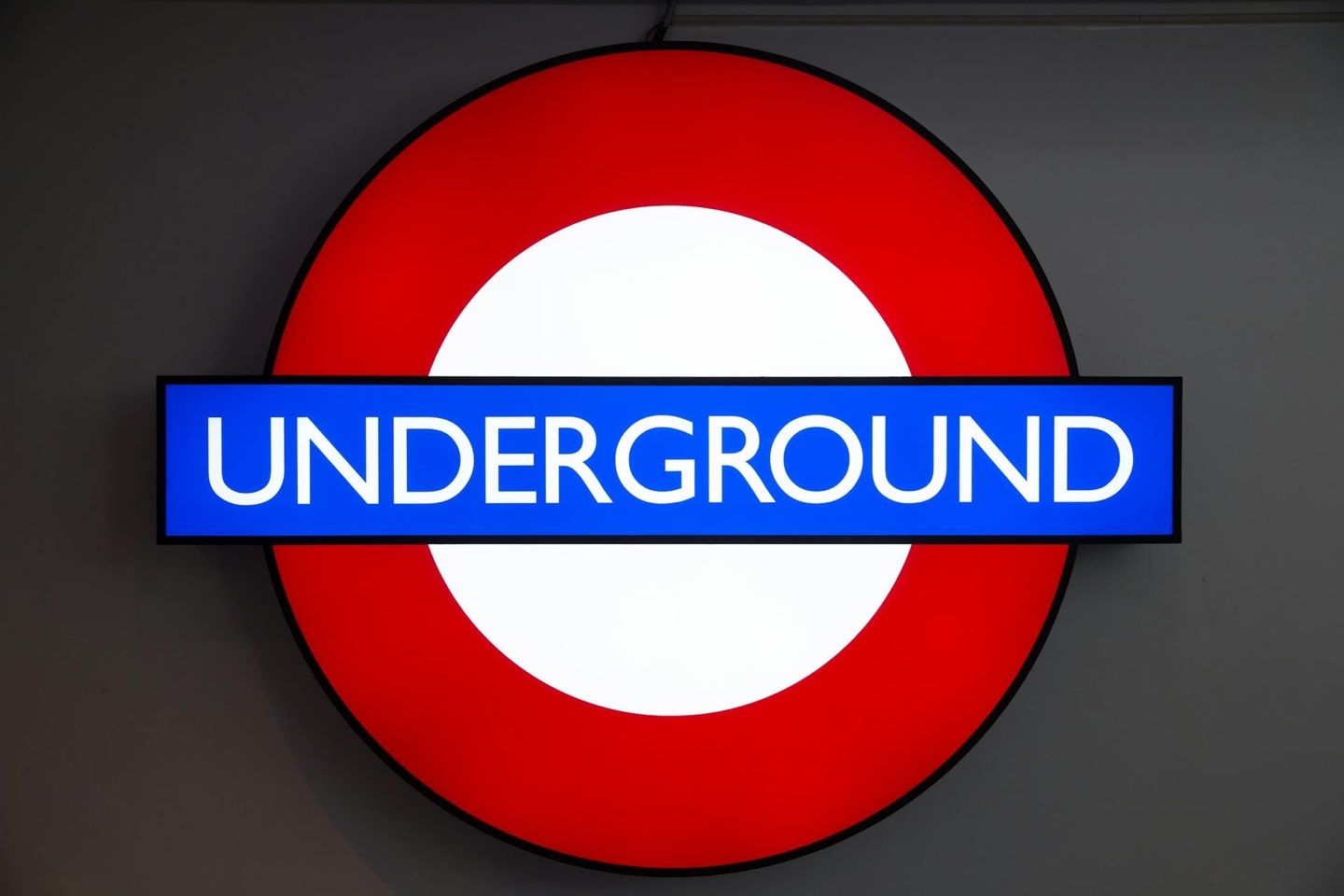
Effective font pairing creates contrast and harmony in a logo. A well-balanced combination enhances readability while adding character. For example, pairing a bold display font with a minimalist sans-serif creates a dynamic yet professional look.
Readability is the key, if typography is hard to read then the design fails. Brands like Visa and Subway successfully use contrasting fonts while maintaining clarity. Thoughtful font selection ensures logos are both aesthetically appealing and functionally strong.
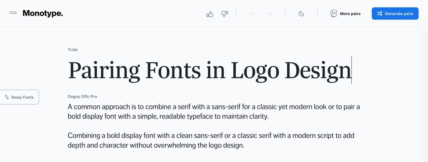
Use Monotype or similar services to find a complementary font pair for your chosen font.
Custom Logo Typography
Custom typography enhances uniqueness and brand identity. Unlike generic fonts, custom lettering ensures originality and exclusivity. Brands like Coca-Cola, Disney, and Google use distinctive typography to reinforce recognition and personality.
Hand-drawn or modified typefaces add authenticity, making a brand stand out. Whether subtle adjustments to an existing font or entirely bespoke lettering, custom typography builds a lasting, memorable brand image.
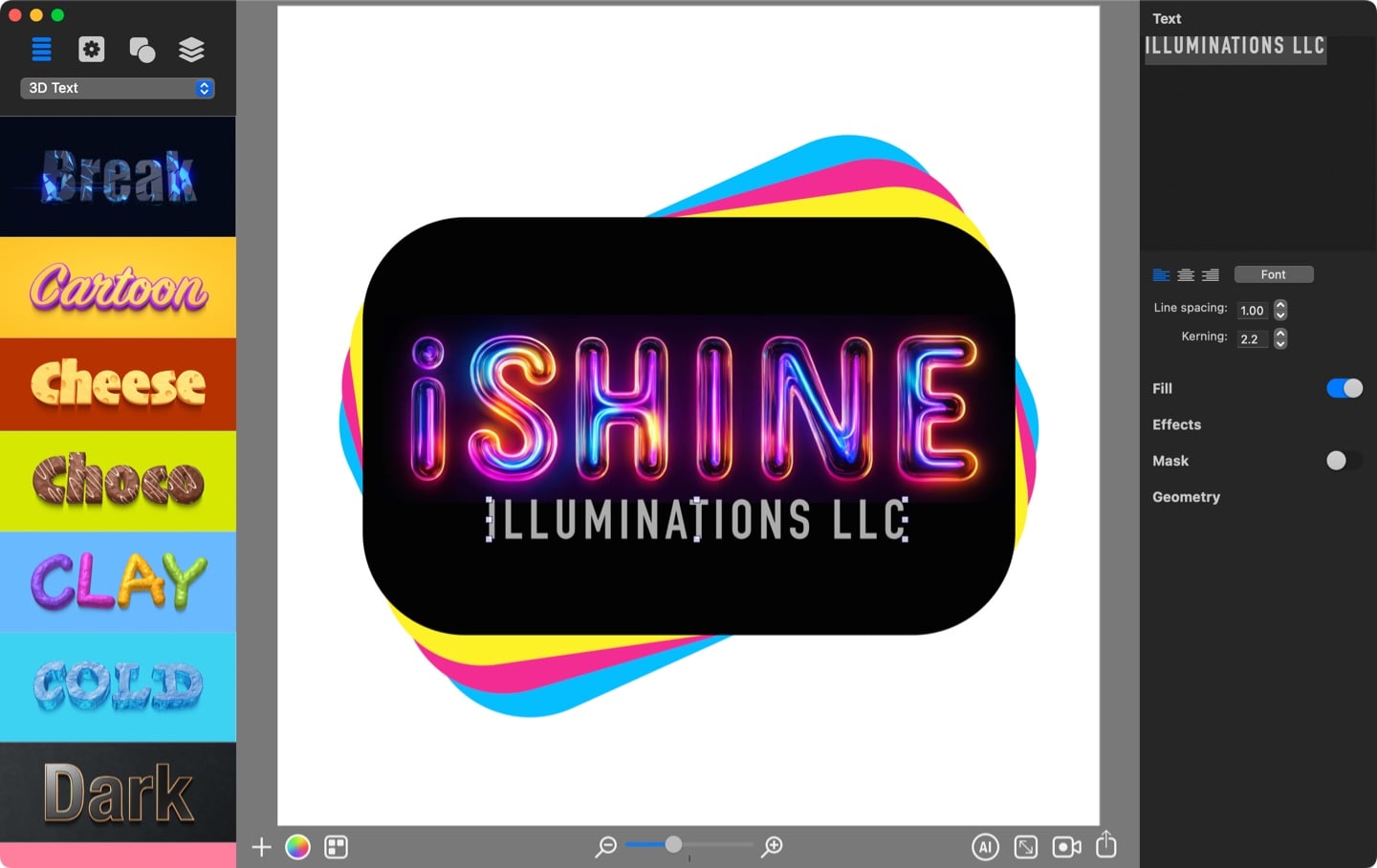
With graphic design apps like Art Text, you can create a wide range of text effects and typography graphics to perfectly convey your brand identity.
Text Legibility and Scalability in Logo Design
A great logo remains readable at any size, from business cards to billboards. Testing typography in digital and print formats helps ensure clarity across mediums.
Highly decorative fonts may look appealing but lose legibility when scaled down. Clean, well-spaced typefaces preserve readability, making the logo more versatile and impactful. Simplicity enhances recognition and adaptability.
Color Psychology
Colors influence emotions, perceptions, and behaviors. In branding and logo design, choosing the right colors helps convey a brand’s personality and message. For example, blue often represents trust and professionalism, red evokes energy and passion, and green symbolizes growth and sustainability. Different colors can create strong emotional connections and shape how a brand is perceived by its audience.
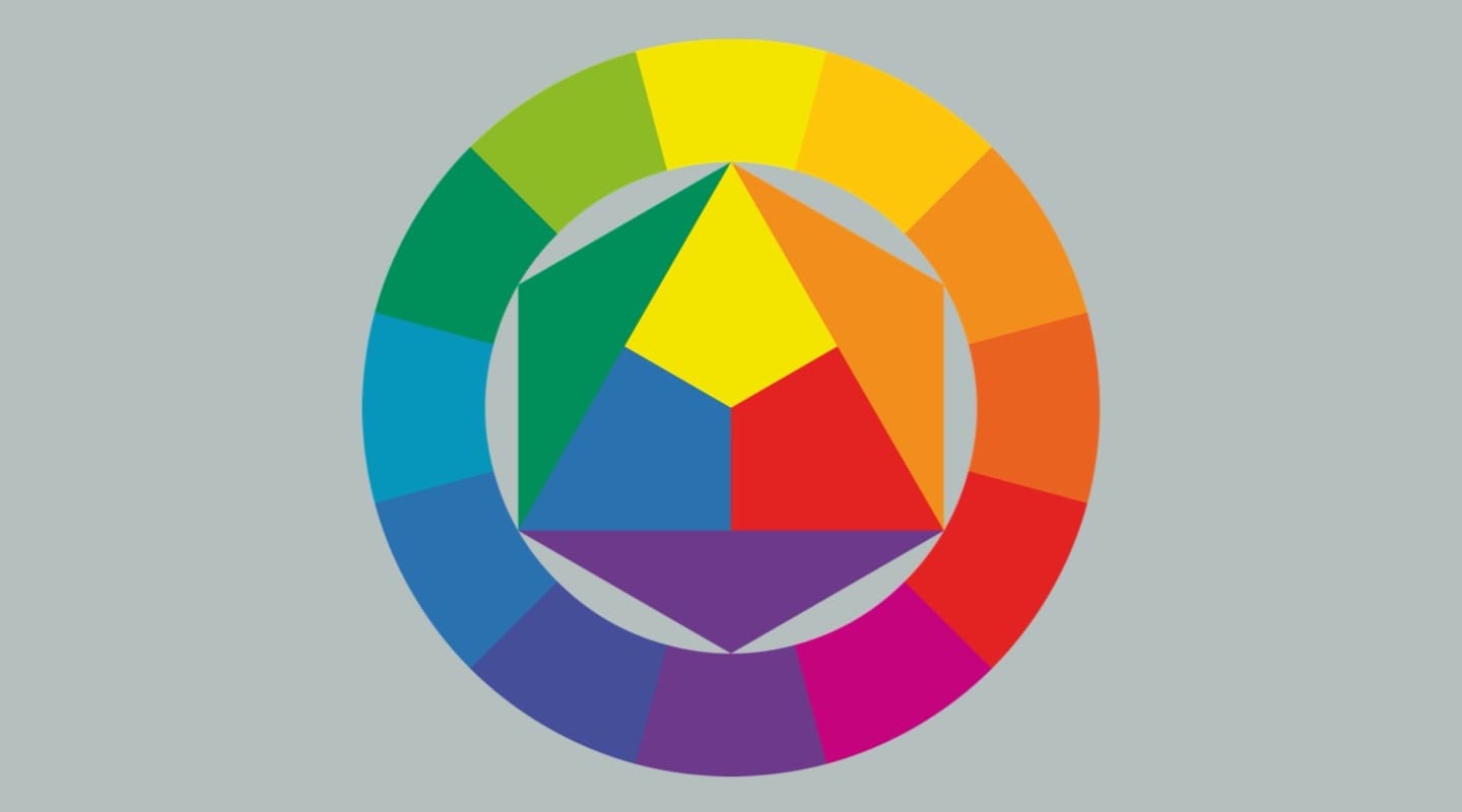
Colors are categorized into three groups:
- Primary colors (red, blue, and yellow) are the foundation, as they cannot be created by mixing other colors.
- Secondary colors (green, orange, and purple) are formed by combining two primary colors.
- Tertiary colors (such as red-orange or blue-green) are created by mixing a primary color with a secondary one, offering a broader range of hues for design.
Colors from these three groups can be combined in a logo design according to three common color combination schemes (analogous, complementary, and triadic) that influence how a brand or a logo is perceived.
What to Watch Out for When Designing a Logo
Using too many fonts clutters a logo, reducing its professionalism. Sticking to one or two complementary fonts ensures clarity and consistency.
Ignoring proper spacing and kerning affects readability and balance. Poorly spaced letters can alter meanings or create visual strain. Careful adjustments maintain a polished look.
Following fleeting font trends can make a logo feel outdated. Timeless typography keeps branding relevant and impactful for years.
