7 Tips to Enhance Your Social Media Accounts
Define Your Brand Style for Social Media
To decide on your visual identity for social media, graphics is the first thing to consider. Without choosing your priorities and content standards, your results will be random, which will make it more complicated to monitor your progress. Take your time choosing the best typefaces and colors that perfectly describe your brand, as well as the mood and message you would like to convey.

Create Templates for Your Custom Graphics
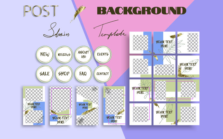
Keep in mind that less is more. Too much of a variety of social media graphics will decrease the overall value of your profile. It is standard practice to keep some content repetitive—it will, therefore, be simpler for users to analyze your news, as well as differentiate your branding from others in the market. To make the challenge even simpler, prepare your custom templates beforehand and broadcast them quickly when breaking updates emerge.
Have a Set of Distinguishable Templates for Different Post Themes
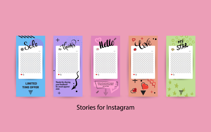
This piece of advice is really interconnected with the previous one. The more visually trackable the posts are, the easier it is for viewers to find the content they are seeking. The fast speed of information delivery is highly appreciated these days. For instance, your post cover image for discounts and promotions can be marked with purple patterns, while life hacks you want to share with your readers can be marked with blue ones.

Don’t Forget about Color Balance
Colors are more meaningful than they may seem. Around ninety percent of fast decisions and judgments are based on the shade palette applied by a brand. Knowing how divergent tones influence people’s minds and souls is crucial since it allows the creation of the required atmosphere and leads to the desired experiences among the target audience. Brand color psychology is a stalwart tool to make your content engaging and guide the first impression in the best direction possible.

Select Typography for Your Social Media
Lettering and typography are just as important as adding interactive social media graphics to your network portfolio. There are plenty of typefaces to choose from. The rule of thumb is to stick to a couple of them, diversifying your headings from body text, as well as image cover titles.

Take Eye Movement Patterns into Account
With the knowledge of visual attention patterns, you can advance your social media graphics. Your images shouldn’t be overcrowded with too many meanings and styles and vice versa. Such patterns will help you place important aspects to draw attention to the right place on the layouts. It is like placing different goods on different shelves in a local grocery store—simplify the path from supply to demand.

Adjust Your Design Based on Analytics
In simple terms, social media analytics gather and analyze the influence of network content and measure how fast and efficient the decisions are that are made on their basis. This approach allows you to find hidden insights and improve the quality of your social media graphics, making it convey qualitative messages in the right manner and time.
Creating Social Media Graphics with Art Text
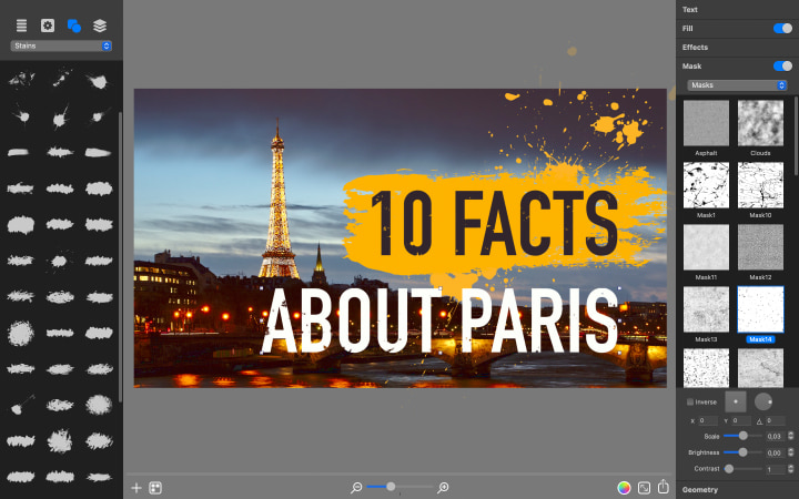
Multiple requirements may easily become confusing and devastating for beginners, so keeping all the social media design production within one interface is incredibly convenient and effective. Thanks to the varied palette of Art Text tools, both beginners and masters in the industry can ease their workflow and access stylish and eye-catching social media graphics.

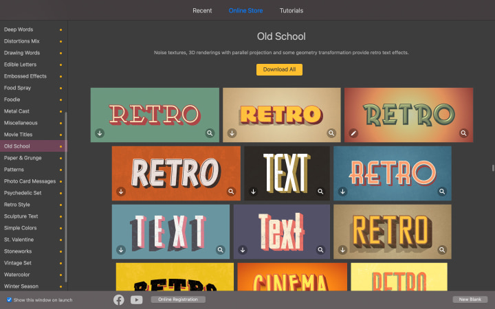
Vast opportunities for custom image creation are accompanied by a set of pre-designed templates for social media. What’s more, the system will automatically offer the right dimensions if you choose a particular social media document type, which will simplify your task of preparing attraction-grabbing content. Download the Art Text free trial and enjoy the process of creating influential and meaningful social media graphics.
