What Is Minimalist Graphic Design?
From daily life to graphic design, signs of minimalism can be observed everywhere. The influence of this style is more meaningful than it may seem. In the world of illustrations, minimal forms and formats are fundamental for making the space less crowded. With the help of its tools, each and every object is the center of attention—there is no need to add visual intensifiers to let the quality shine.
In plain English, a minimalist design is aimed at delivering large benefits via clean and clear messages. The number of tools, shapes and color palettes may be standard types only, but the final result is more memorable than complex images. Since 1917, when minimalism was just a type of art, this stream has filtered down through multiple niches, and the future of minimalist graphics promises to be exciting.
Key Principles of Minimalist Graphic Design
People often think that minimalist graphics come with elementary illustrations only. In reality, the best approach to this should sound as follows, “Less, but better.” Implementing basic principles of minimalist design in your work will allow you to appreciate the true value of every pattern and line.
Simplicity
There are thousands of beautiful and astonishing things out there, so the desire to show off as many of them as possible is human nature. However, by avoiding too many graphic elements, you clear the final image and allow the function to be more enhanced through visual patterns.
Visual Hierarchy
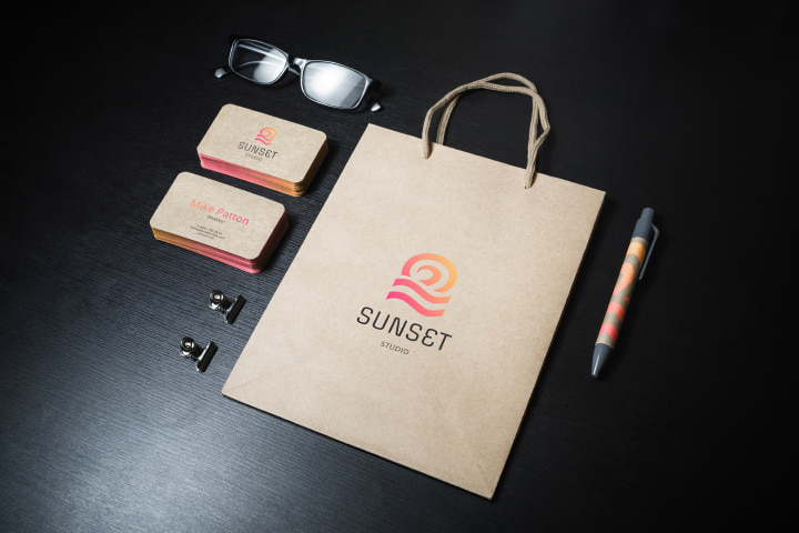
Of course, placing only one object and using just one color will make your graphics extremely minimalistic. However, if you want to include more information, you will need to structure your design properly. Visual hierarchy helps to show which elements of the design are more important than others. Experimenting with sizes, shades, shapes and composition peculiarities, you create the game rules. This strategy allows your information to be transmitted in the right order—literally, you are the one who guides the readers’ eyes in the necessary direction.
Neutral Colors
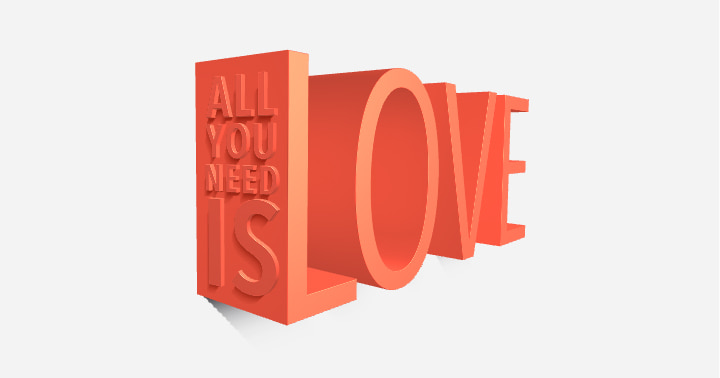
When dealing with colors, simple is the key. It doesn’t mean bright colors are forbidden, but neutral palettes will maintain the overall vibe more effectively. It is better to incorporate a few clean well-balanced tones that reflect a calm mood instead of searching for shades that turn out to be chaotic and nerve-wracking.
Font Choice
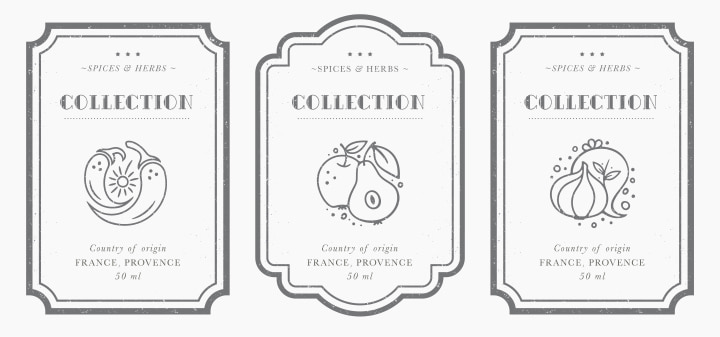
Typography and lettering should be minimalistic as well. The number of graphic elements shouldn't become overwhelming; however, a simple yet unique font can help get your message across. Whatever font you are more likely to select, don’t forget to consider its psychological impact on viewers. The text has to be straightforward and readable.
Negative Space
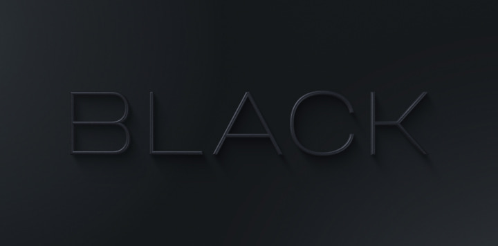
This term is applied to define a design with vast blank spaces. Such a strategy may seem to be a waste of layouts, but the reality is quite the opposite. Thanks to negative space, the image remains clean and functional. When it comes to minimalist graphics, you shouldn't be afraid of empty spaces. On the contrary, they attract viewers’ attention to the main heroes of your layout.
Neo-Minimalism Movement
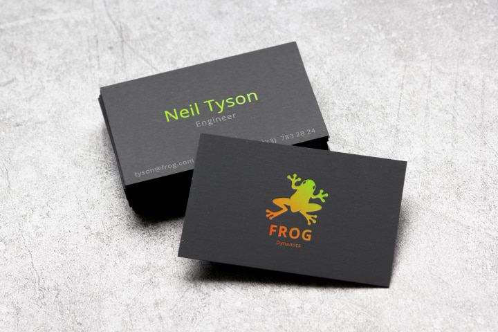
Neo-minimalism has been described as minimalist graphic design on steroids—even more attention is given to basic elements of projects. It is actually more challenging, however. Maximum creativity is required for really minimalist illustrations. The contrast of black and white, with the choice of a monochrome image in the foreground, results in a powerful message. Complex designs may lead to negative results that are less memorable, less persuasive and less satisfactory. So, neo-minimalism establishes the right focal point and makes the layout stand out with contrast, balance, open space and symmetry all at the same time.
Art Text for Minimalist Graphics
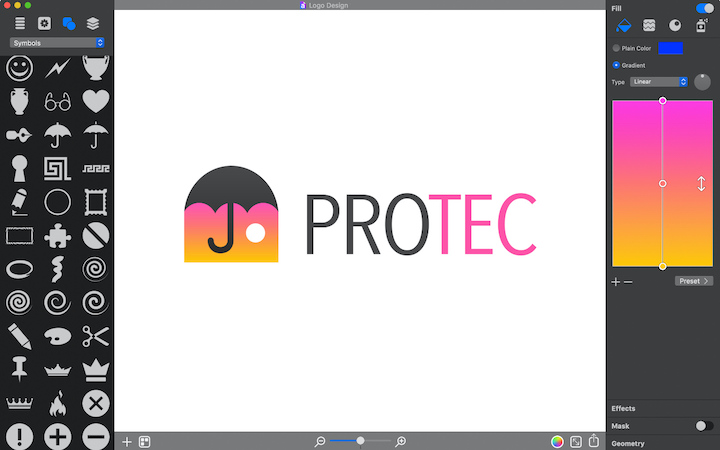
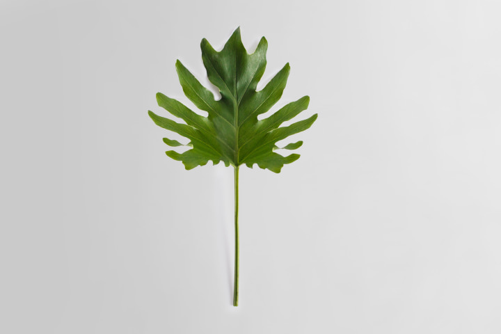
Just like any other design, minimalist graphics require the corresponding tools. Art Text makes any level of user techno-savvy by minimizing the learning curve. Customizable templates and presets are the key to letting your projects function smoother and look airier. Less hassle and bustle guarantee more focus on the layout’s hidden senses and allow you to visualize your ideas in a powerful manner.
Art Text will come in handy for different tasks, from creating a logo for your brand to styling your brochure text with headings and titles. The fewer visual effects and objects you apply, the easier execution and accuracy control will be. All in all, minimalist graphic design opens the doors to multiple universes, and Art Text is a convenient vehicle to enter them. Check it out!
