Here are some design tips for creating retro typography:
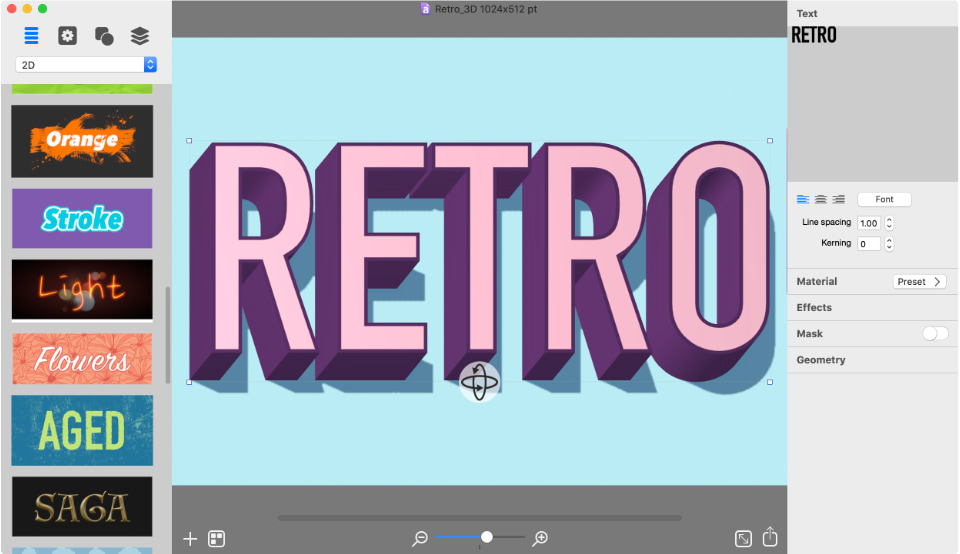
- start by creating a 3D text,
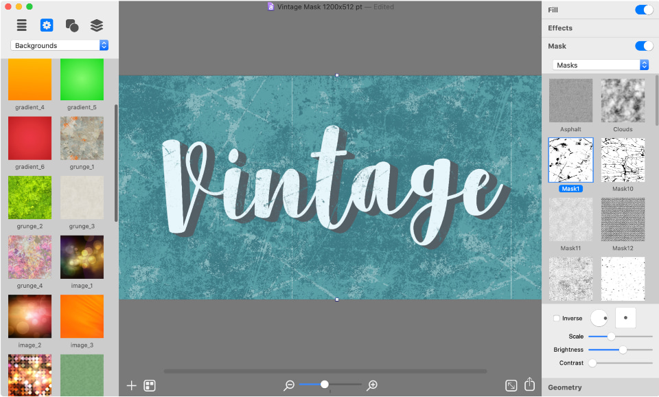
- add a mask for an aging effect,
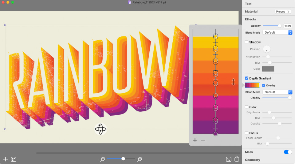
- set up depth gradient for rainbow effect in retro text,
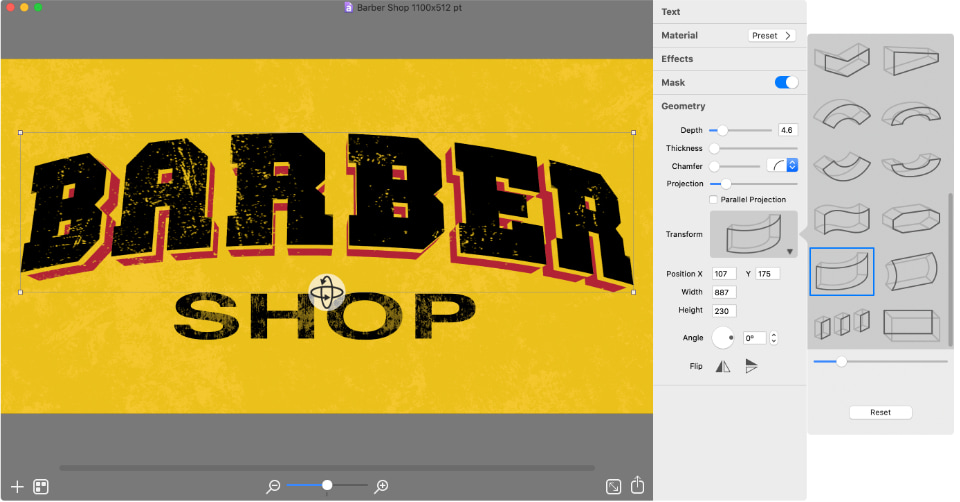
- shape your retro typography,
- experiment with fonts and color mixing.
Usually retro style typography is a simple 3D text with minimum effects applied. With Art Text for Mac creating 3D text is as simple as keyboard typing thanks to a unique 3D engine. Art Text allows you to rotate and position the text in all three dimensions, set the depth and thickness and select a chamfer.

Mask is probably a must have effect when creating a retro typography. Adding a mask to the text or the entire graphic will simulate the aging effect. Art Text offers a choice of over 140 mask textures with scale, brightness and contrast options to attain the desired vintage effect.

The side color of your 3D text can differ from the front texture, and that’s when Depth Gradient comes in handy. Retro texts usually have one or two color changes on their sides, however there is some retro typography that contains multiple colors on the side. Art Text lets you add as many color transitions as you like.

Another premier feature of retro typography is the bent or squeezed shape. Using shape transformation presets offered by Art Text, you can effortlessly twist 3D text in almost any shape imaginable.

To conclude, it’s not necessary to use all of the above-mentioned tricks, but you can combine them in any order you like to achieve different retro typography effects. Also, note that the text font and colors you use play significant role in creating a vintage effect. Give Art Text a try to see how easy it is to create your own retro title for a website, presentation, flyer or brochure.
